Welcome to class 3B
WELCOME TO CLASS 3B!
Here you are going to find all the information about our lovely projects plus our socials and contacts!
Please change your device orientation to landscape
Welcome to class 3B
Here you are going to find all the information about our lovely projects plus our socials and contacts!
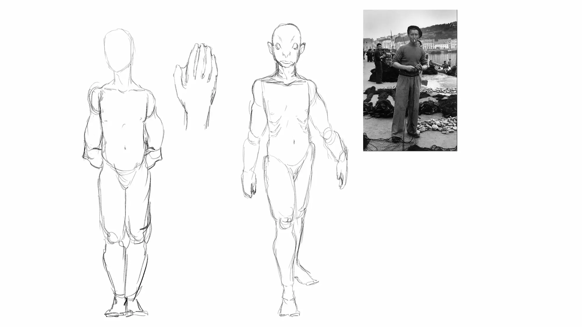
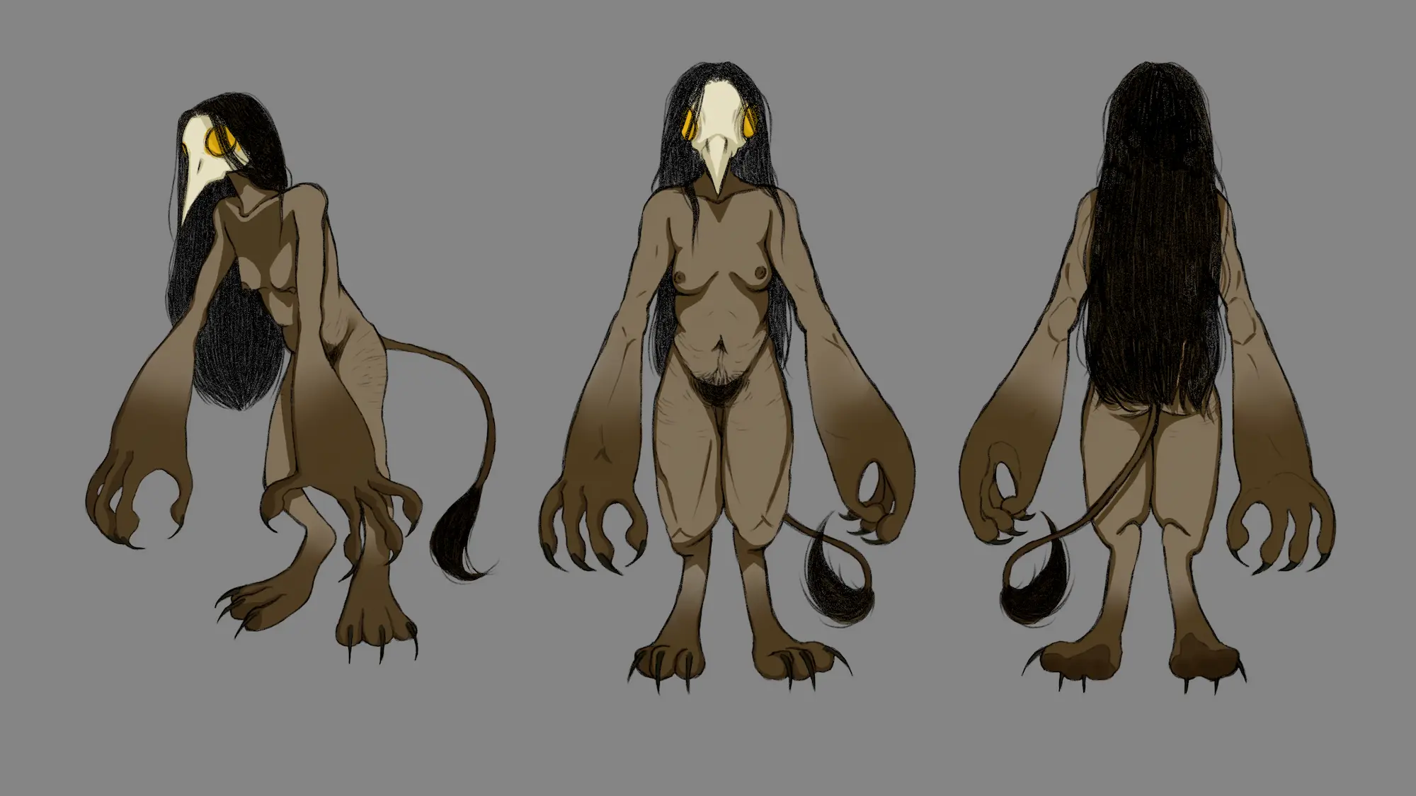
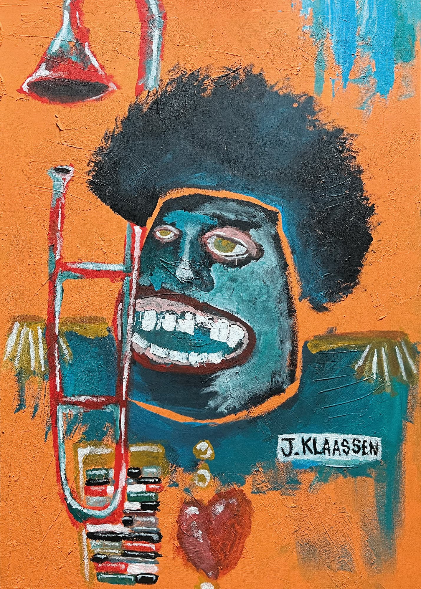
Asia Kaczmarek
Hi! My name is Asia Kaczmarek, and I’m from Poland! I am an illustrator inspired by slavic
folklore and horror, as well as my own memories and experiences. I love to design monsters
and creatures and think of their stories. My work is mostly digital, with a focus on pixel art
and digital painting!
Contact information:
Email: kaczmarek.joanna@mail.com
Instagram: atoohyda
Tumblr: atoohyda
Phone: +48600108802
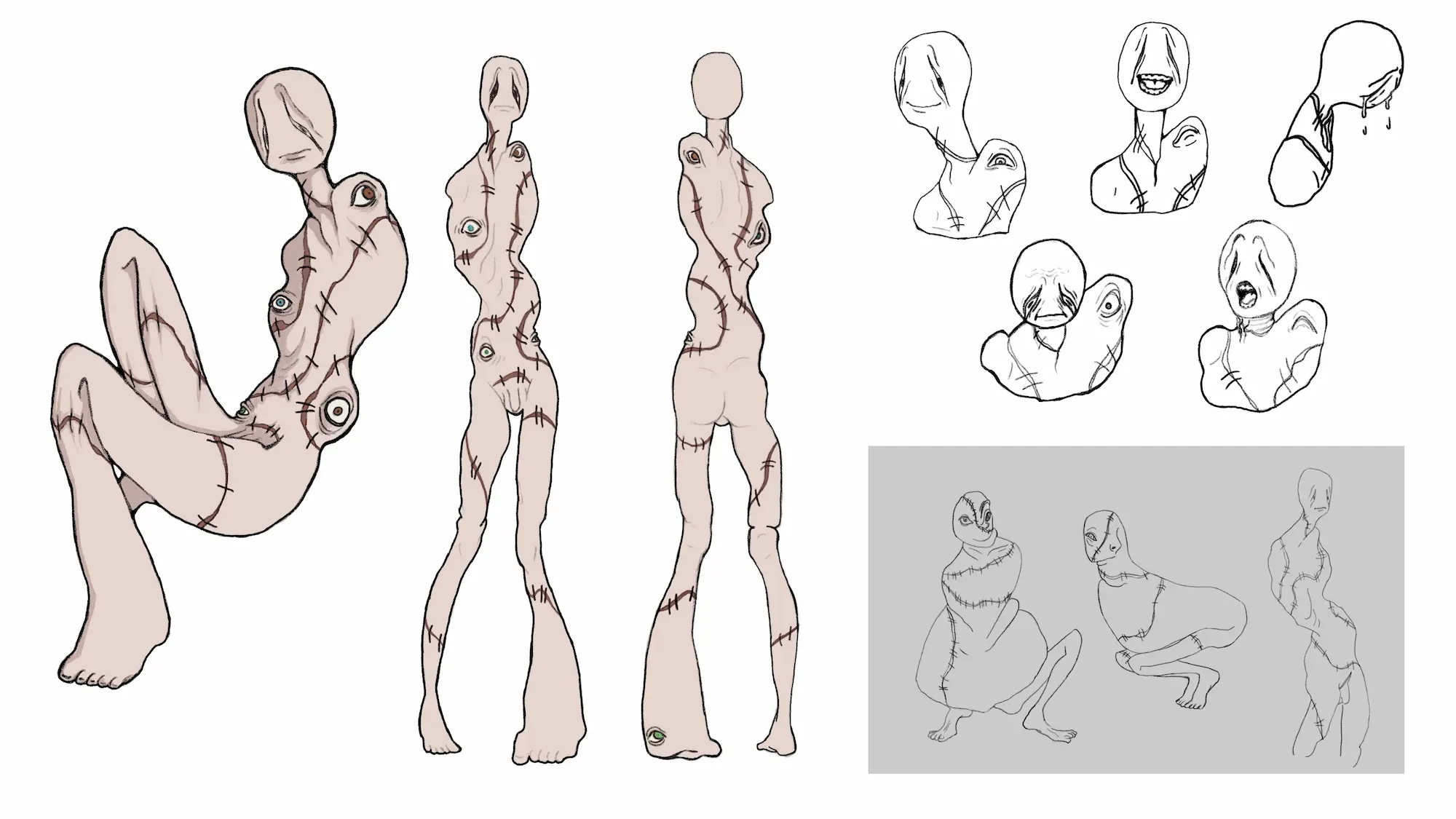
My project is a concept book for a visual novel dating sim I would like to make in the future. It
focuses on characters I created and designed, who are thought of as monsters, but when
you get to know them better, they turn out to be just as lovable as anyone else.
Their stories are inspired by my own experiences growing up as a queer person. When I was
a teenager discovering my queer identity, I had to face bullying and lack of acceptance
around me, which made me feel like a monster. Even though I deserved love and care, I was
treated like I had the plague for the simple fact of being queer. My wish is for every queer
person to know that they are perfectly fine, and that they deserve happiness no matter what.
I wanted to create characters, who through their own struggles manage to learn they
deserve to be loved and wanted. Each of them has a story that makes them feel like they
don’t belong. The goal of the player is to get to know them, bring down their walls and show
them that there is nothing wrong with them, all while hopefully falling in love!
I separated the characters into three different locations, which are inspired by my home
country - Poland. In each location, you can find a different character and get to know them!
Read their story, what inspired their creation and design
Marenne Klaster

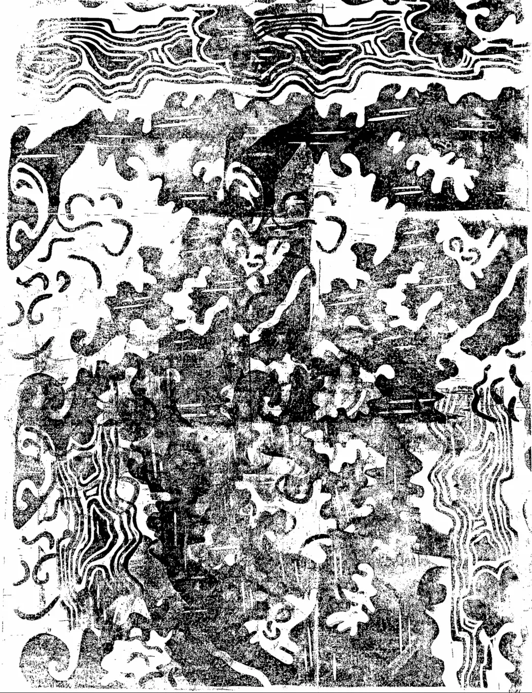
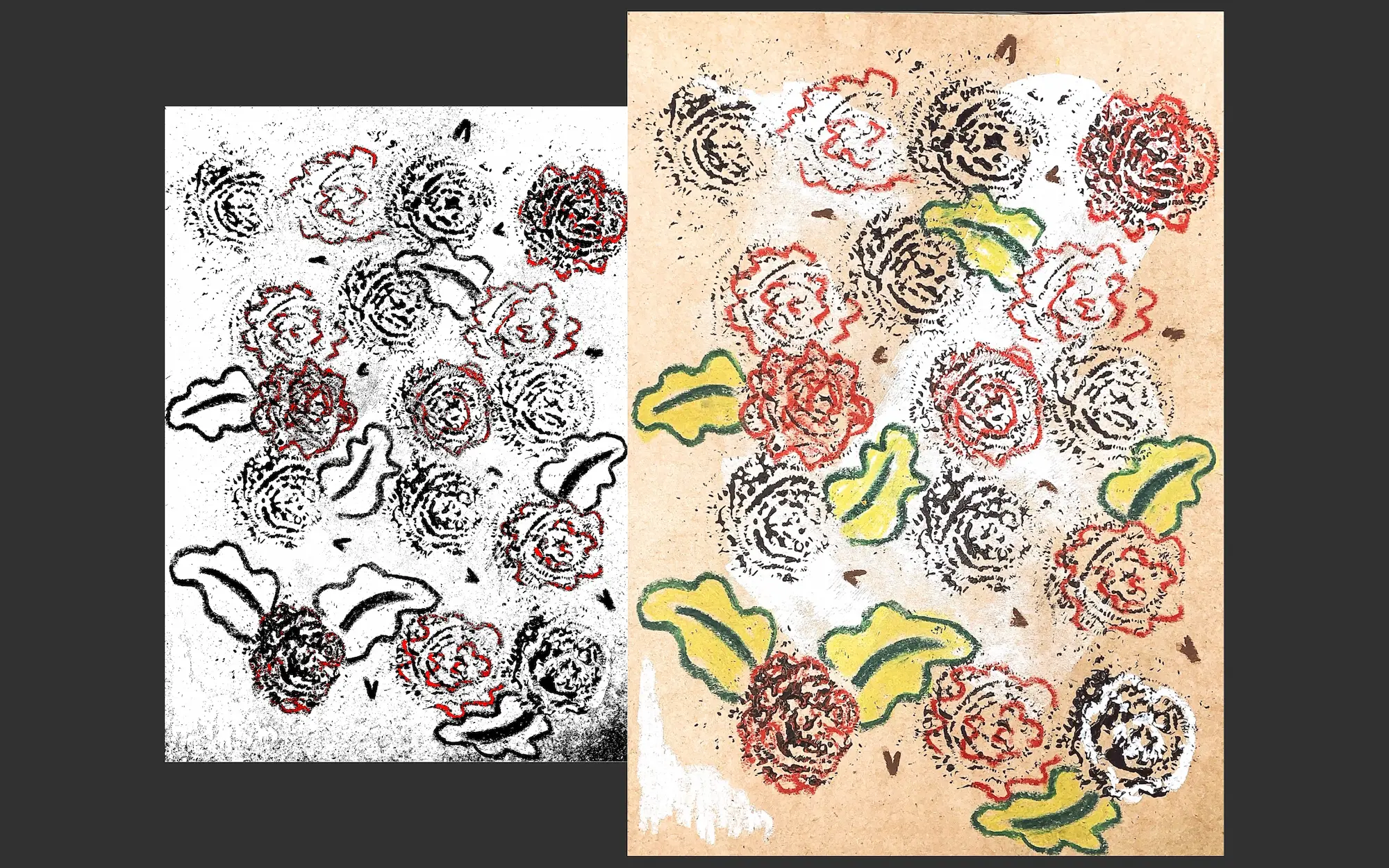
My name is Marenne and my focus in design is tattoos. My goal in the professional life is to become a tattoo artist with my own characteristic style. My inspiration mainly comes from nature, I really like to create designs picturing plants, flowers, and animals. How I work is I come up with an idea, then I’ll make a collage of this idea. If the collage works well (placement, composition, combination of pictures) I will use this as a starting point for a new tattoo
Contact information:
Email: marenneklaster@gmail.com
TikTok: maerdesign
Instagram: maer__design
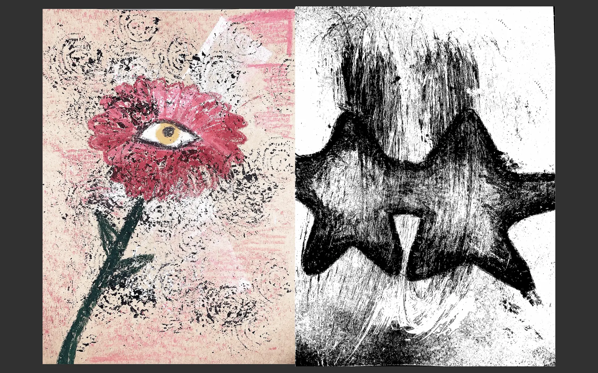
WE ARE NOT THE WORLD
This school assignment had the theme: “The future”. Often, with the future as a theme, someone would start thinking about their desires or wishes. “Will I be as successful as I hope to be?”, “Will I find the one?”. This time, when I was thinking about the future, I looked at it from a different perspective. What is happening right now, that will for a fact have influence on our future? I ran into this interview from 1966, in which children talk about what they think will happen in their future. Our now. Their predictions were not very exciting. They say that there will be wars, nuclear explosions, overpopulation, overconsuming, automation, and more. The most disturbing part is when you realize how much of that is actually true. When I think about the future, I think about how we, as people, are not protecting our own home. How our actions lead to the destruction of animals, nature, the world. How we do not respect other organisms besides ourselves.
In this project I show you my interpretation of pollution. How I went from collage to a tattoo design. Why tattoo designs you may ask. As tattoos are my passion, I also think it is ironic that these designs are made to be put on people, who are the cause of pollution. And maybe, as a real tattoo, it could start an important conversation with others
You probably have seen an artwork before with the same subject as this one. Maybe even multiple artworks. Subjects regarding environmental issues are common amongst artists. But why is this common? Artists have influence. And combined with their artistic talent, artists have the power to create change through their creations and social impact. Depending on their popularity, artists can enhance public awareness of environmental issues and encourage positive actions.
As an artist myself I don’t necessarily want to encourage positive actions. Also, because my audience is not that big, but mostly because I don’t think change can even slightly reverse the consequences of our actions. On the other hand, I would like to spread awareness about this subject, with this book as with all the designs that will hopefully be shown off as real tattoos in the future.
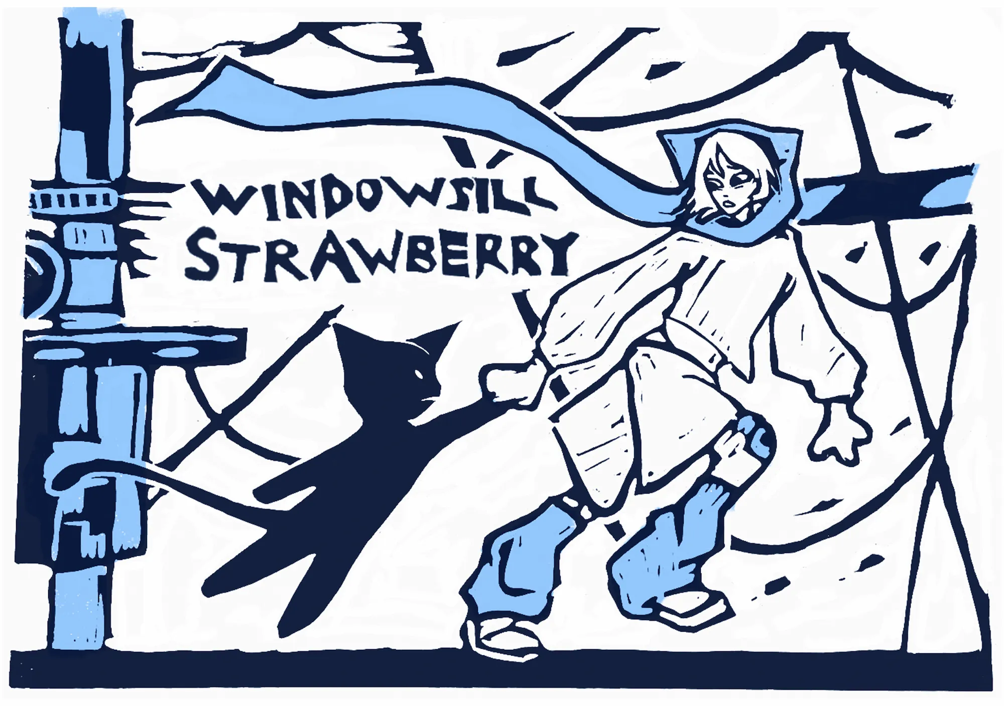
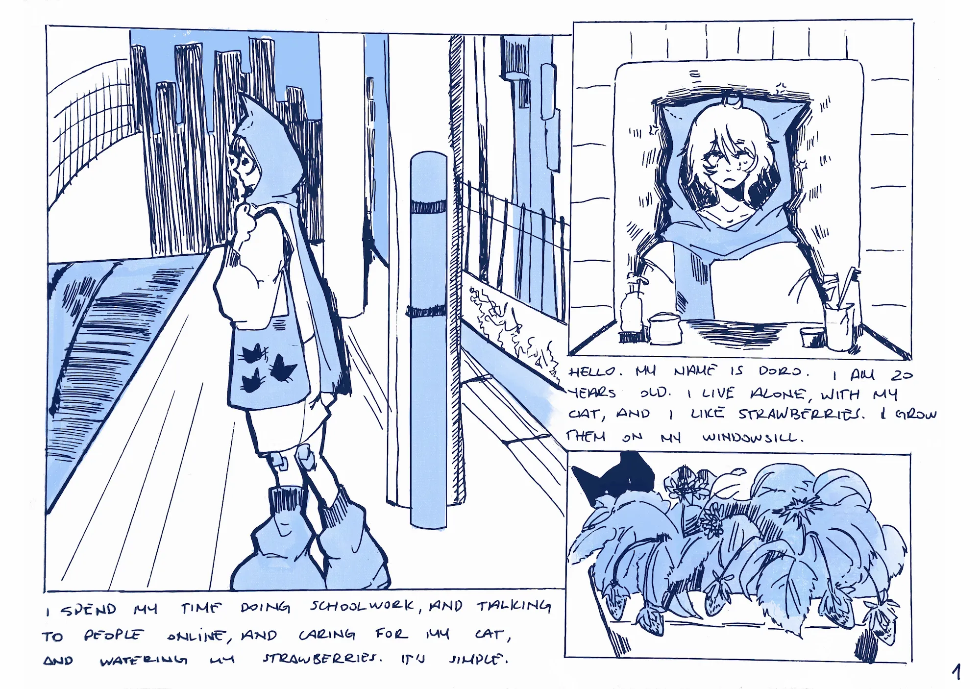
Zeynep Oktem
Hello! My name is Zeynep Naz Öktem.
From Turkish origin, Im a multimedia artist with a passion for risography and linocutting. I focus my work on feelings of nostalgia and familiarity, and am a big fan of all things late 90’s and early 2000’s.
Contact information:
Email: centimetre003@gmail.com
Bluesky: @centim0303
LinkedIn: Zeynep Naz Öktem
Artstation: @centim0303
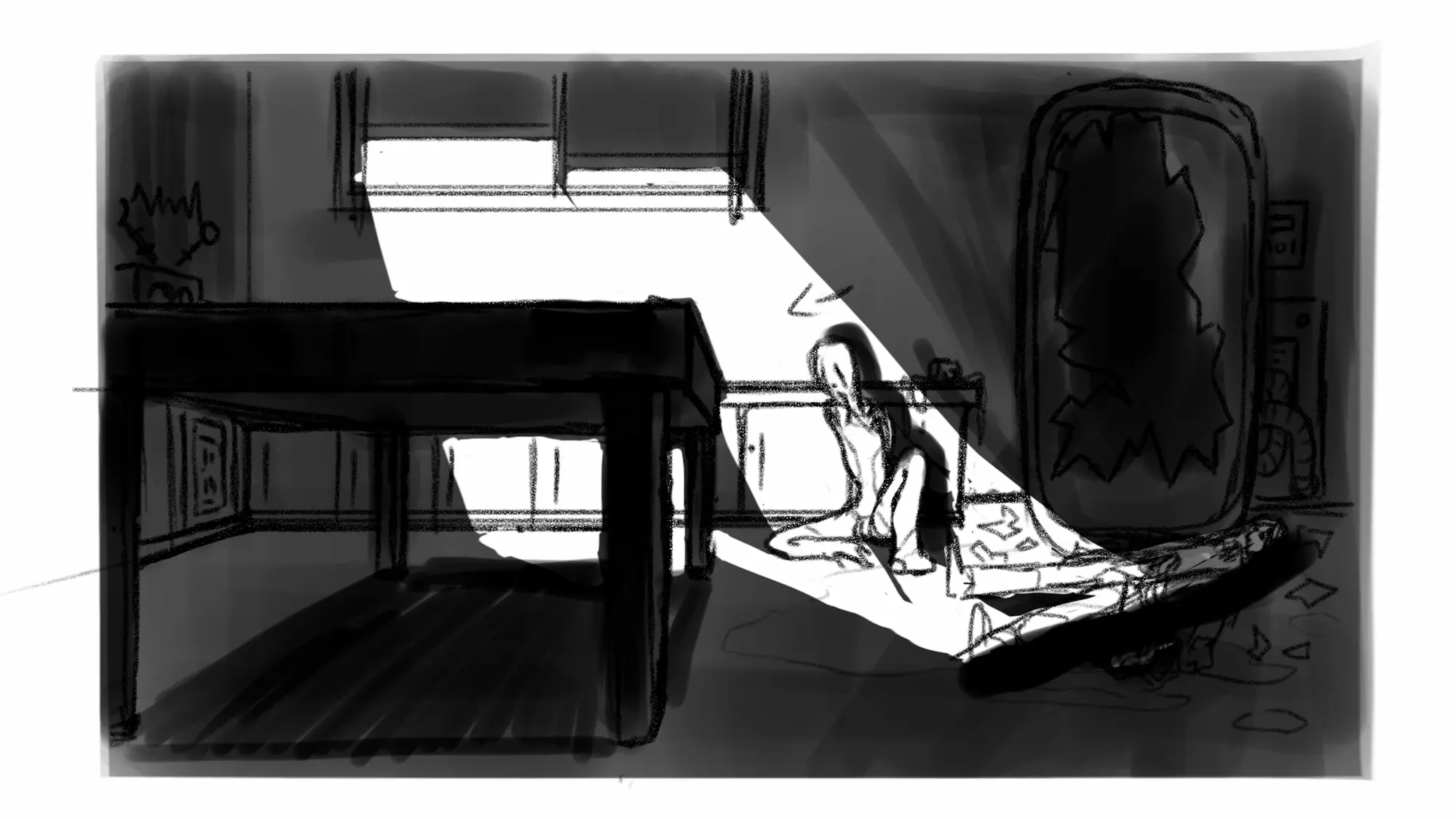
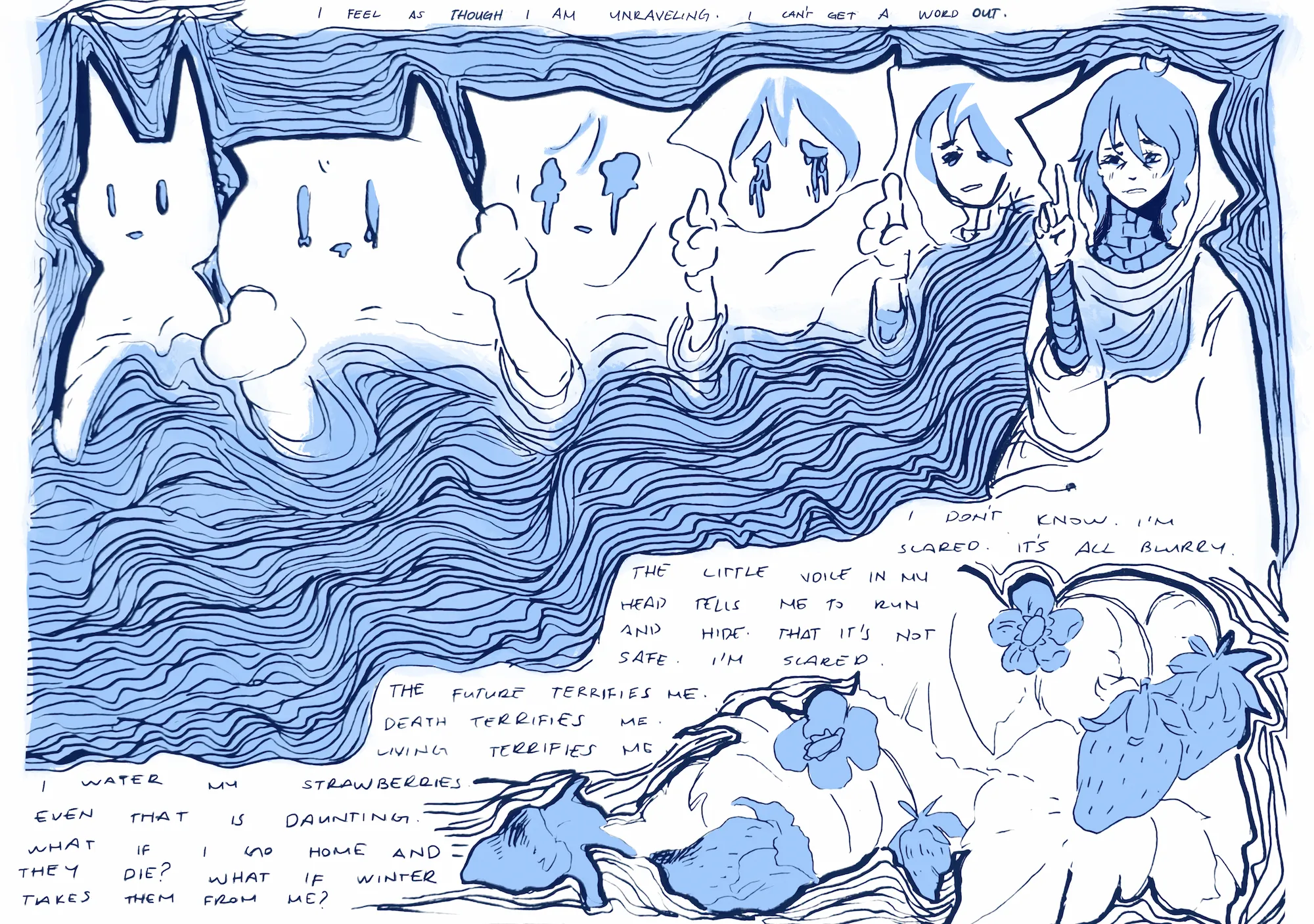
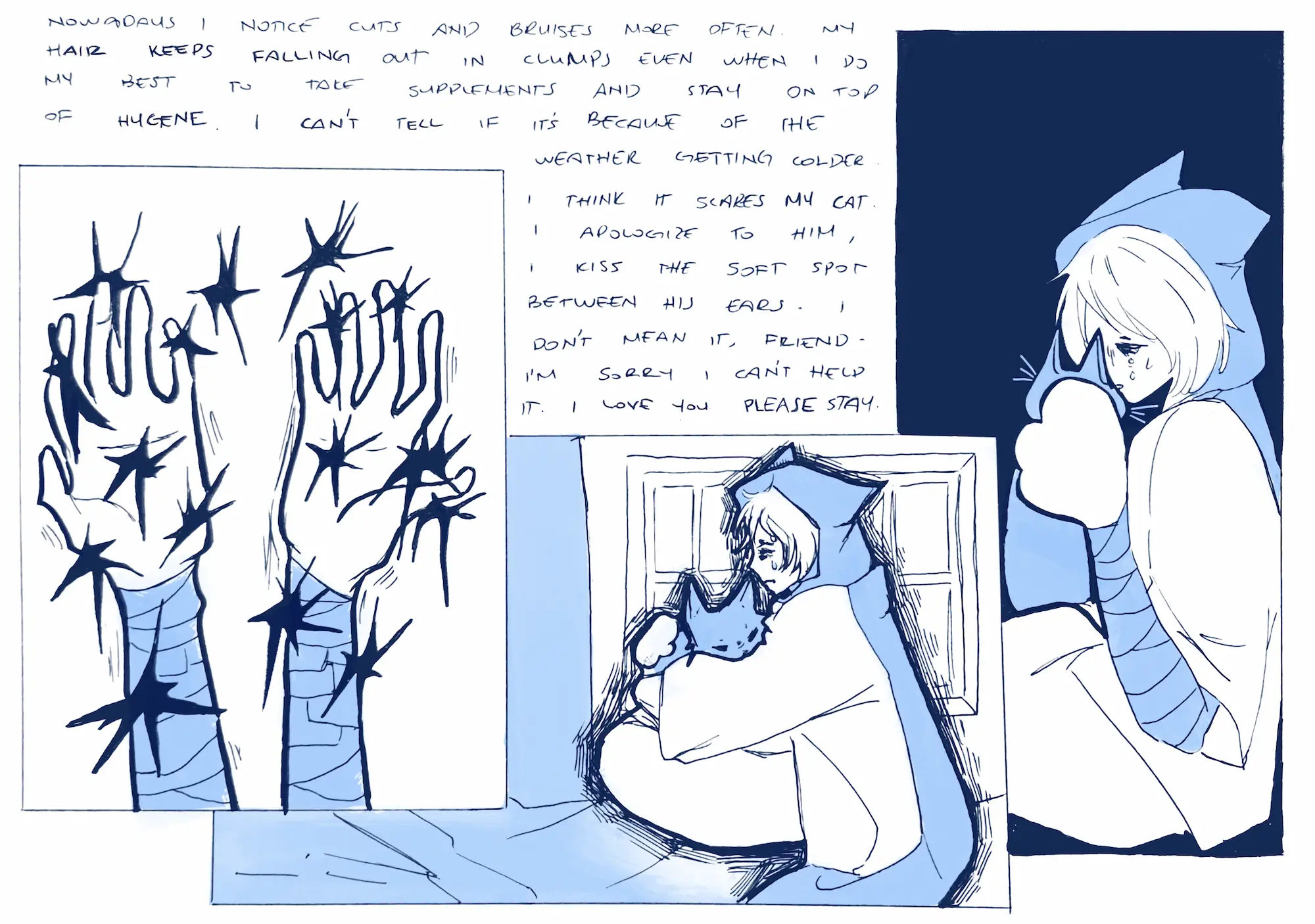
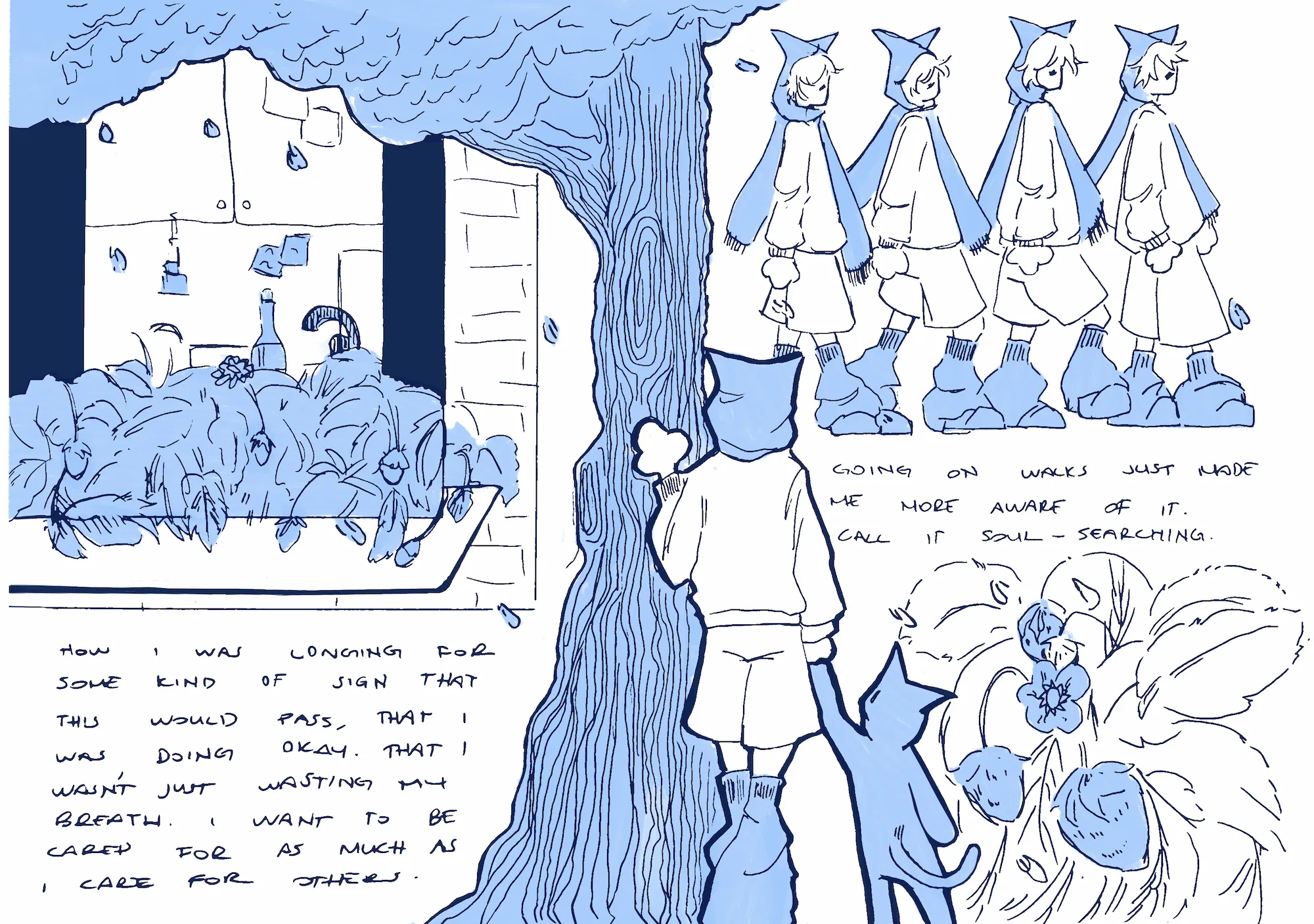
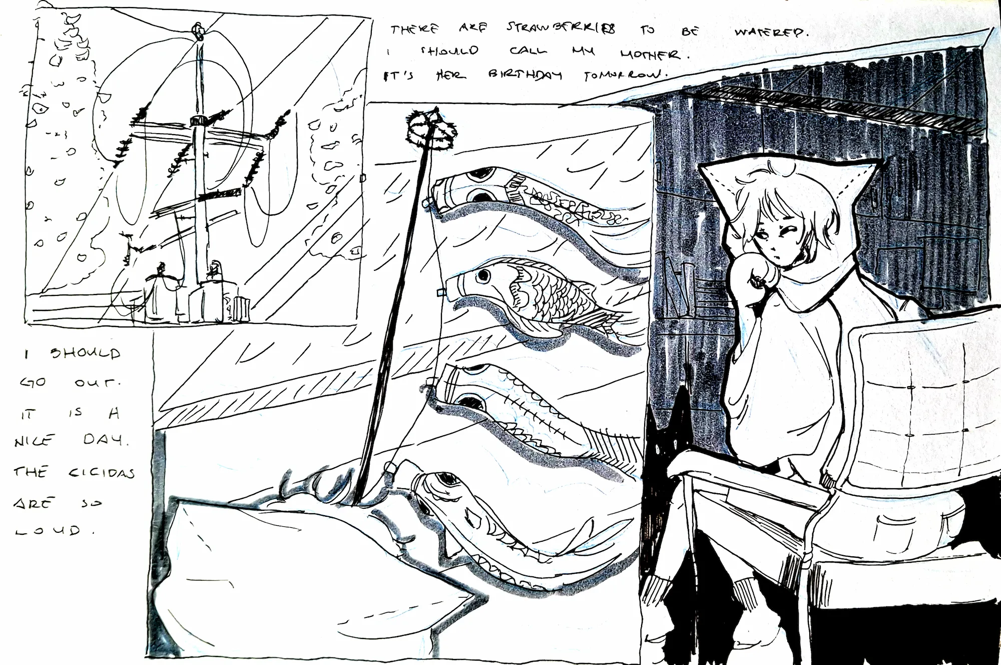
"In the mornings, I make tea. I water my strawberries, I feed my cat, and I don't stand on the train tracks that run by my house on my way to class."
This is a comic based on my experiences I had when I first moved to a new country, and about how I tried to resolve issues I encountered in my own way. I use a variety of techniques here. The cover is linocut, the pages were made traditionally with alcohol marker and gel pens, scanned, edited, and reprinted in risography. For the animation, I used a similar multimedia approach. Using this many techniques was not my original intention, however I think it adds to the feelings of nostalgia and estrangement I wanted to incorporate into the comic. The different printing techniques are akin to that of different feelings for me, while having their origin in the same place, the human person experiencing life.
The primary colors used, (light and dark blue) are meant to invoke feelings of melancholy, a sort of drifting day by day. The tones indicate the two times of day I personally feel most at peace, dusk and dawn, when the earth is silent and you feel like there is only you in the world. That is also why the other figures are all misshapen blobs.
People can sometimes get into situations that affect them in such ways that make them feel like they’re not really connected to reality. With the main character’s design, I wanted to incorporate this dissociation, by giving her inhuman anatomy, such as paws instead of hands in most scenes.
Overall, this comic was a rollercoaster to make, with all the emotional ups and downs of writing such a personal story. I hope you enjoy reading it.
A.M. Rusenova

My name is Anna-Maria, an illustrator and clay enthusiast,
based in the Netherlands. I would describe my work as vibrant and playful. I love turning the world around us into something a bit more whimsical and fun, while still retaining a sense of the familiar.
Contact information:
Website: https://an2a.art
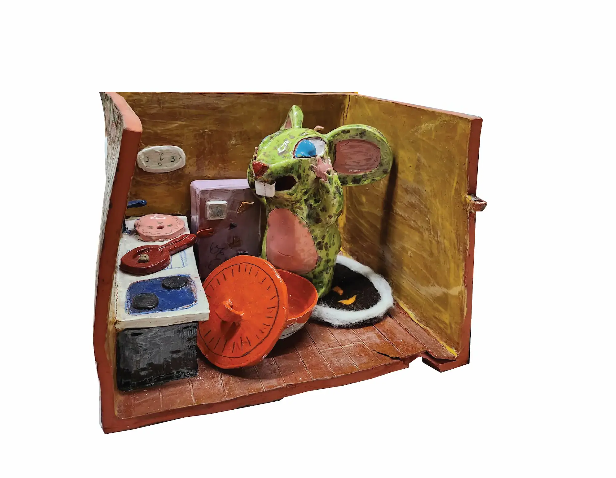
From 2D to 3D
Since the second year something that has greatly interested me was how can I illustrate from clay? I really wanted to find a way to communicate both my illustrations and sculptures into one. So that’s how my project 3D to 2D was created. I came up with the idea of a picture book made from clay and wood, but it doesn’t work the way you think!
Each illustration is built in a clay room that has a wooden door attached to it. When you open the wooden door you are greeted with the “illustration” on one side and on the other the text. I want to viewer to be able to interact with it and really experience reading a picture book without it being an actual printed book!
Kasper Heyne

Hi, I'm Kasper, I love you, humor, taking everything with a grain of salt and being creative. I was born and raised in Stadskanaal, a town in the Southeast of the province of Groningen in the Netherlands. Art has always been a big passion of mine. I mainly focus on illustration and painting where I like to keep things lighthearted. I hope to inspire people to smile more and to take life less seriously.
Contact information:
Email: khh.heyne@gmail.com
Instagram: kunstvankas
My project is focused on wordplay, punchlines and silly jokes.
I took a lot of inspiration from Rogier Roeters who I find very funny.
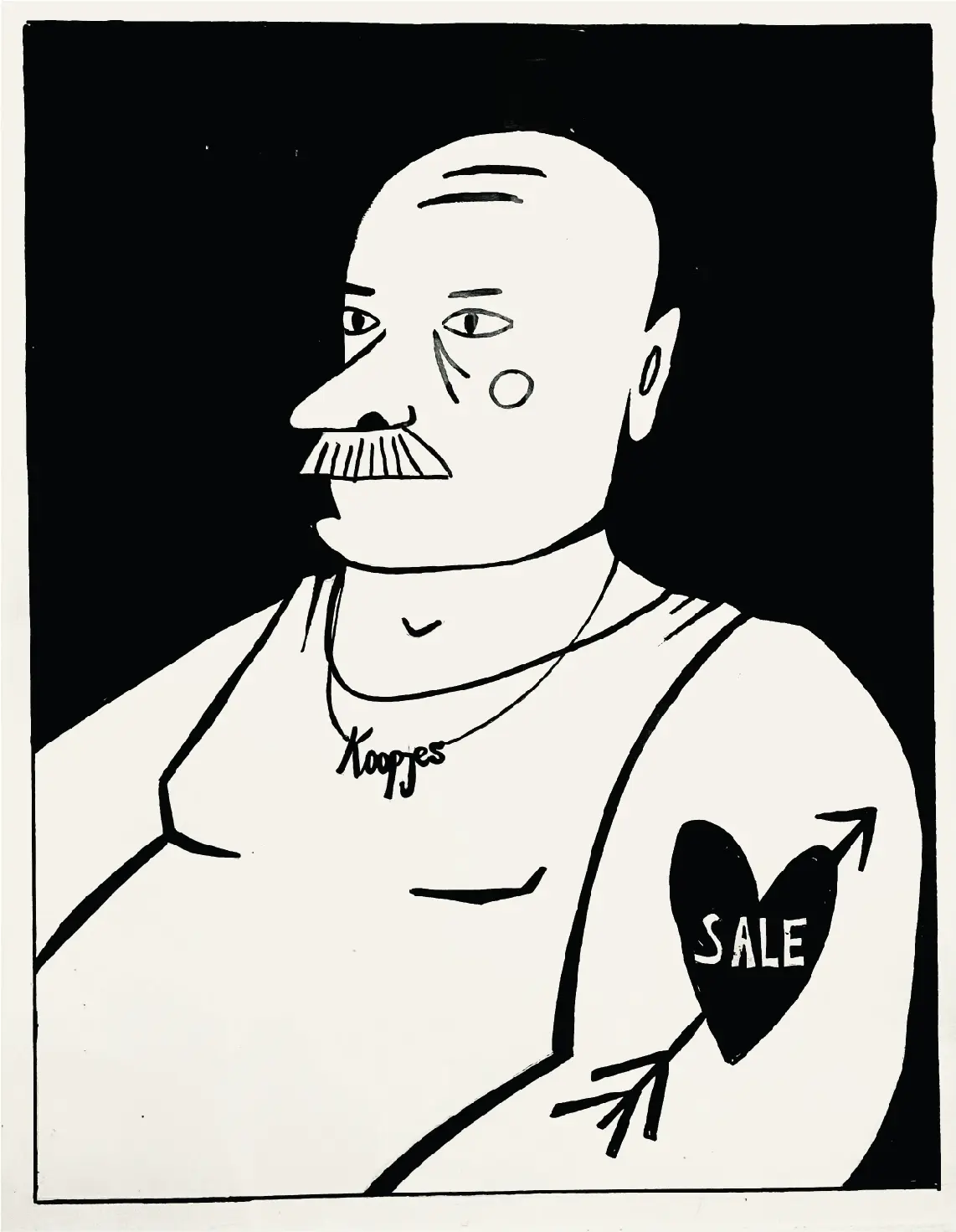
Babette Vegter
I'm 21 years old, and I'm from the Netherlands. My art is inspired by the things I encounter in everyday life. These can be small moments, like a funny situation playing out on the street below my balcony, or larger issues affecting the world. I enjoy transforming these into humorous and colorful illustrations
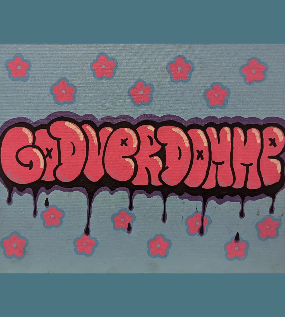
Sucker for sale
In een wereld waar glimmende schermen constant lonken en algoritmes precies weten
wat de zwakke plekken van consumenten zijn, worstelen steeds meer mensen met een
moderne plaag: koopverslaving en de obsessie met uitverkoop.
Elke ochtend begint voor velen hetzelfde: het checken van hun telefoon. Gedachteloos
scrollen ze door talloze advertenties en aanbiedingen. "Tot 70% korting! Alleen vandaag!"
voelt als een schatkaart, een kans om iets bijzonders te bemachtigen. Wat ooit een
zeldzame traktatie was, is nu een dagelijkse routine geworden.
Winkelen is allang niet meer slechts een praktische handeling. Het is een vorm van
entertainment, een manier om stress te ontvluchten of een leegte te vullen. Neurologisch
onderzoek toont aan dat bij het doen van aankopen het beloningssysteem in de hersenen
wordt geactiveerd. Dit systeem, dat sterk afhankelijk is van dopamine -
een neurotransmitter die een gevoel van plezier en beloning opwekt - zorgt ervoor dat
shoppen een verslavende werking kan hebben. Kortingen en sales versterken dit effect
door een gevoel van urgentie te creëren, wat leidt tot impulsaankopen.
Dit gedrag heeft grote gevolgen. Woningen veranderen in opslagplaatsen, vol met spullen
die nauwelijks worden gebruikt. Kleerkasten puilen uit met kleding waarvan de
prijsstickers er nog aanhangen. Tegelijkertijd groeit de schuldproblematiek. Veel mensen
raken gevangen in een cyclus.
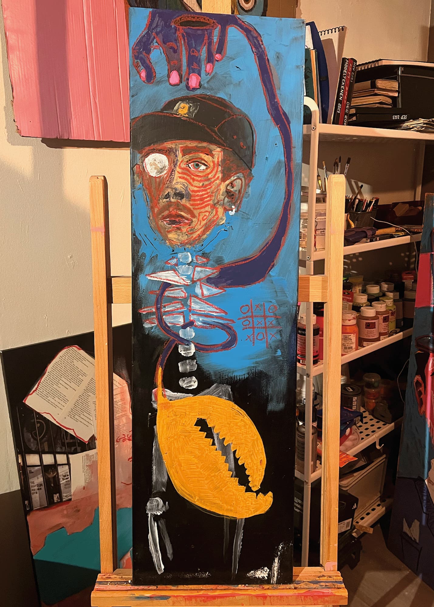
Nynke Van Der Weit
Hi, I’m Nynke Van Der Weit, a 23 year old Dutch student at Minerva Art Academy in Groningen and a passionate beginner tattoo artist.
Skills: Making tattoo designs, sculpting, painting, sketching, experimenting, ink, and working with mixed media.
Contact information:
Email: nynke775@gmail.com
Instagram: biepboepbap
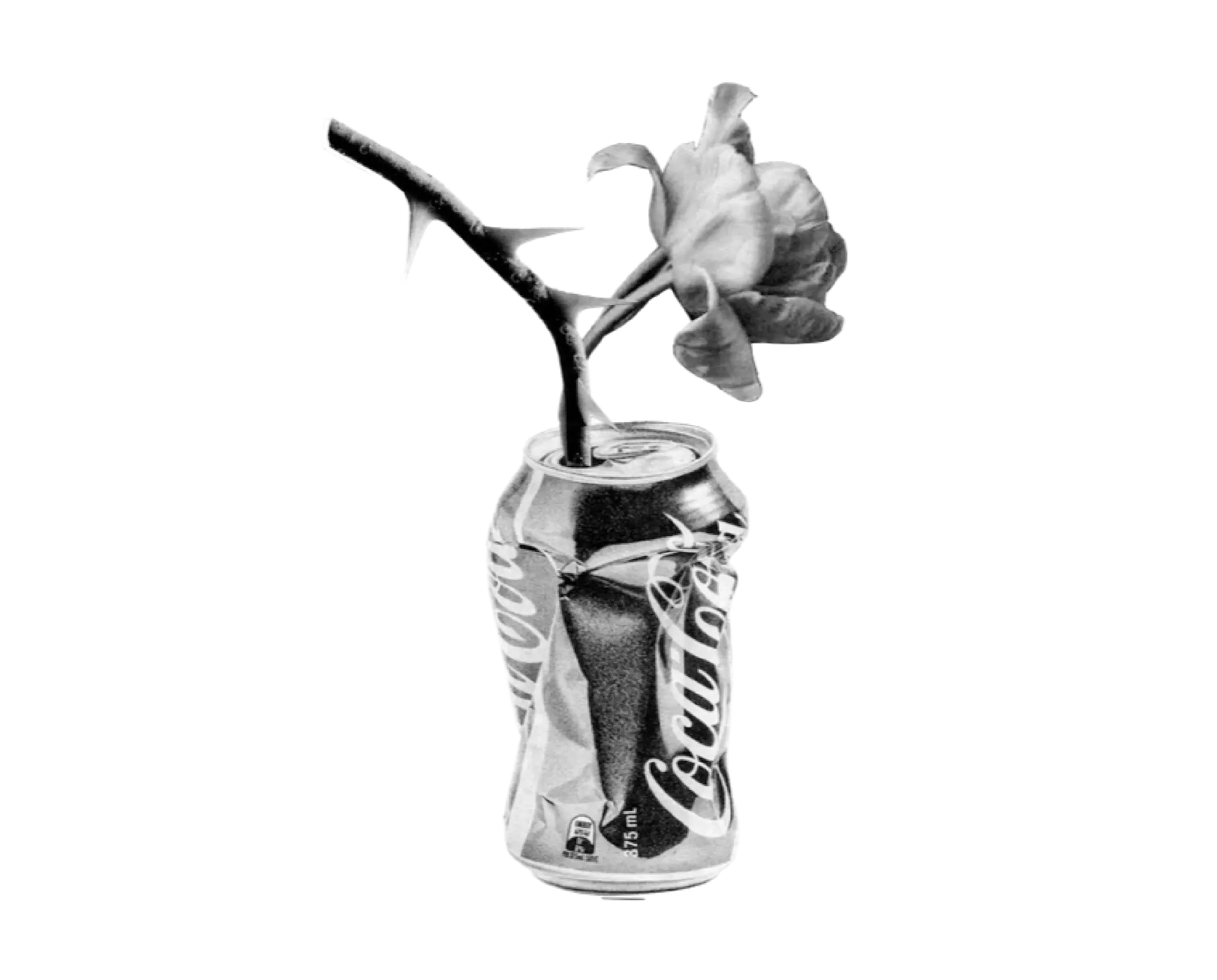
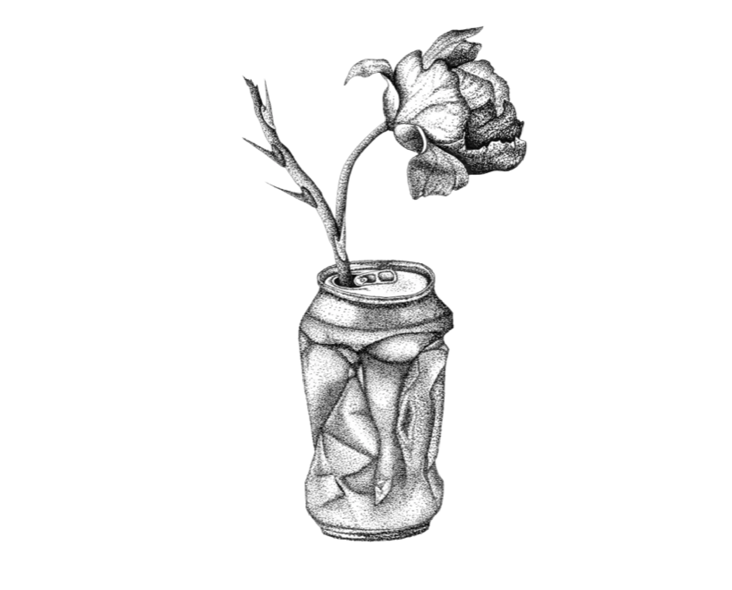
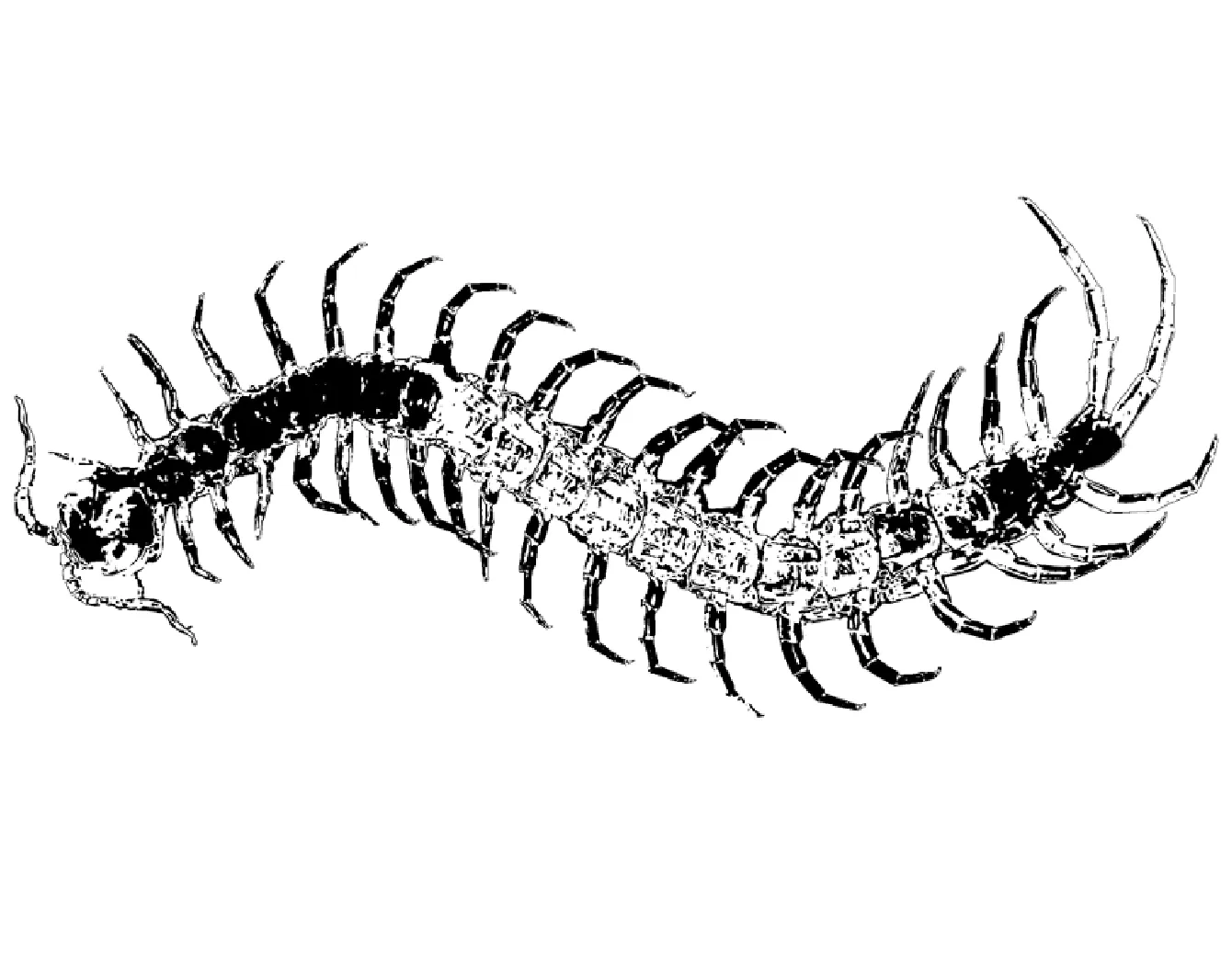
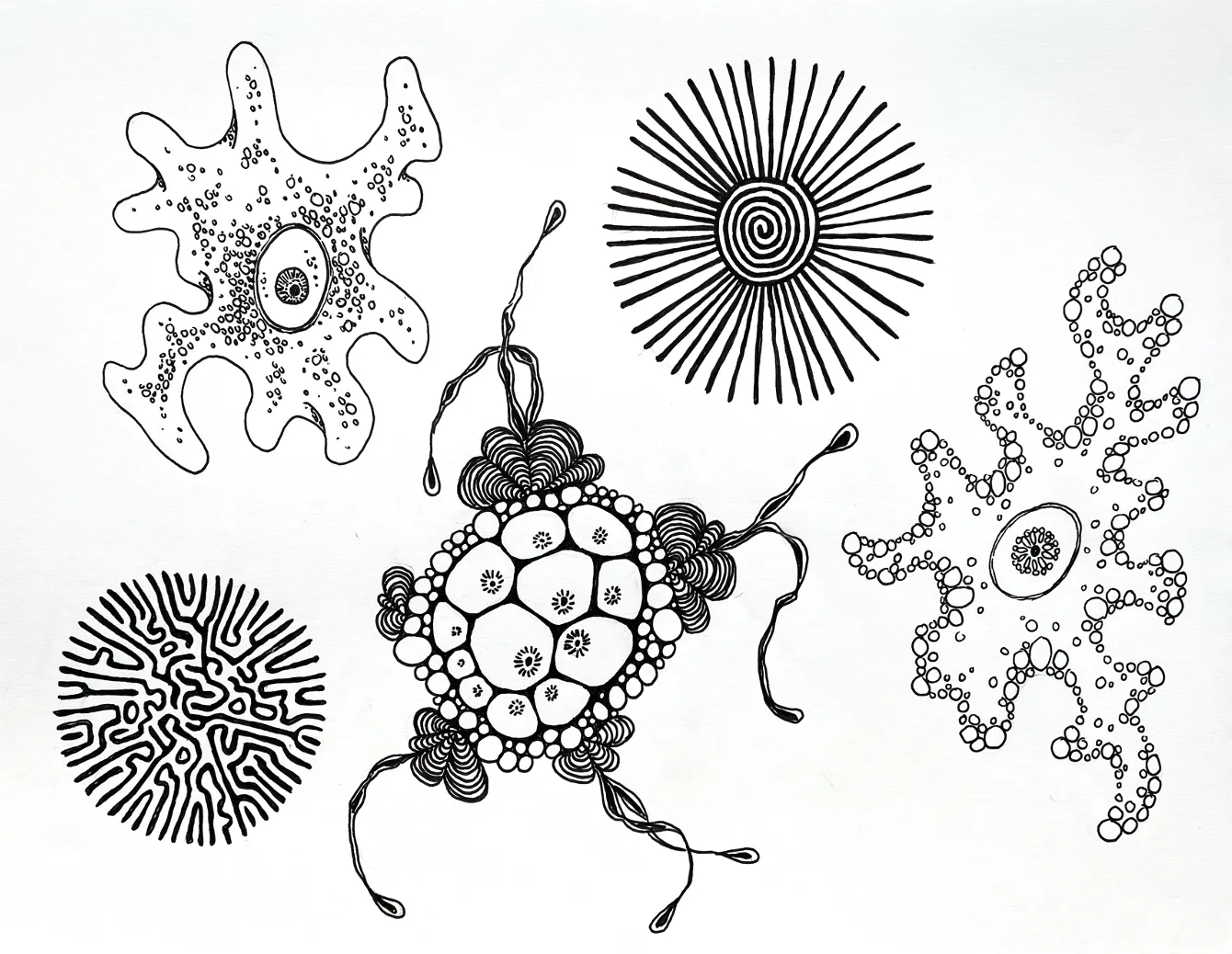
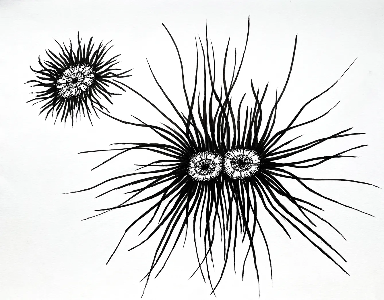
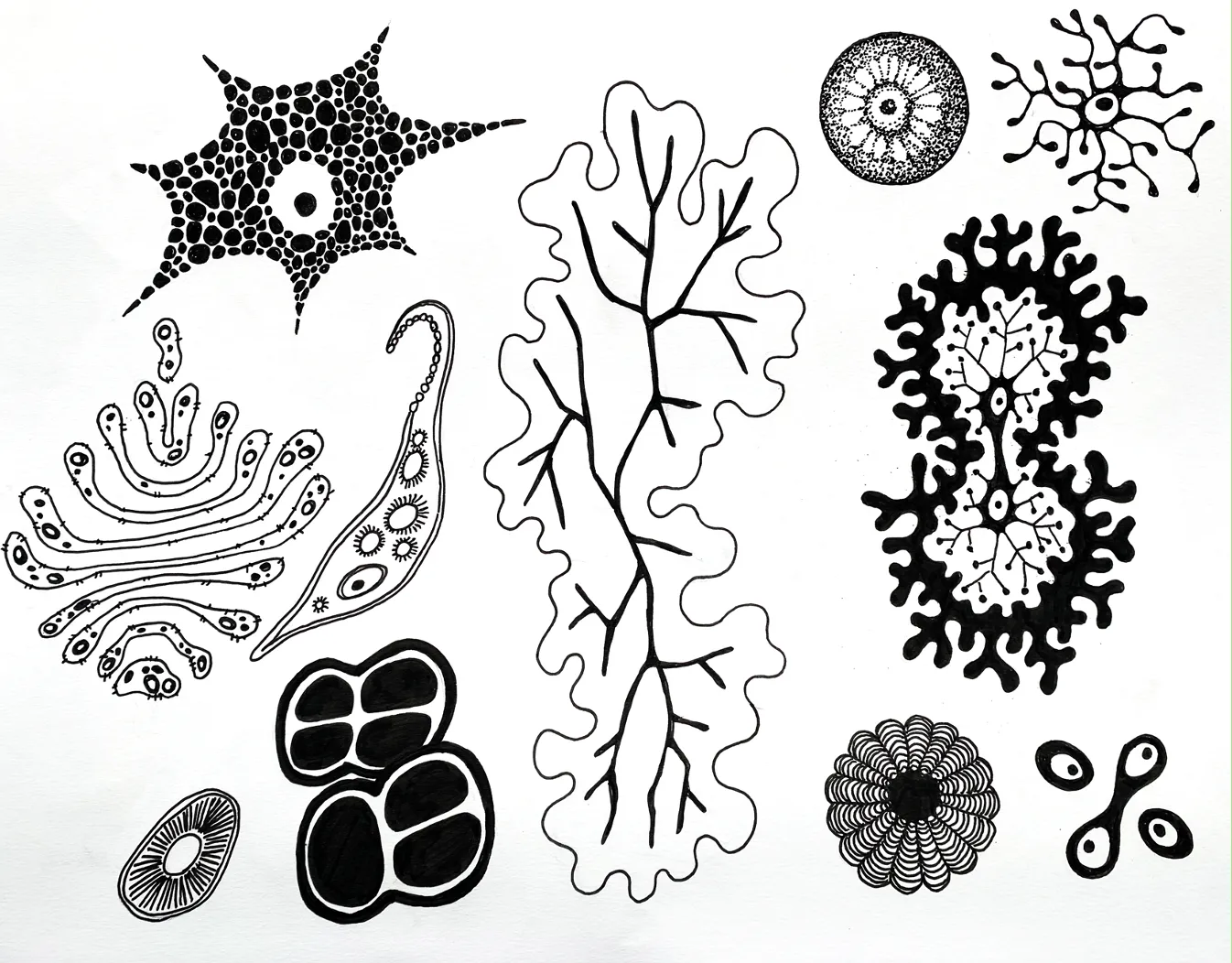
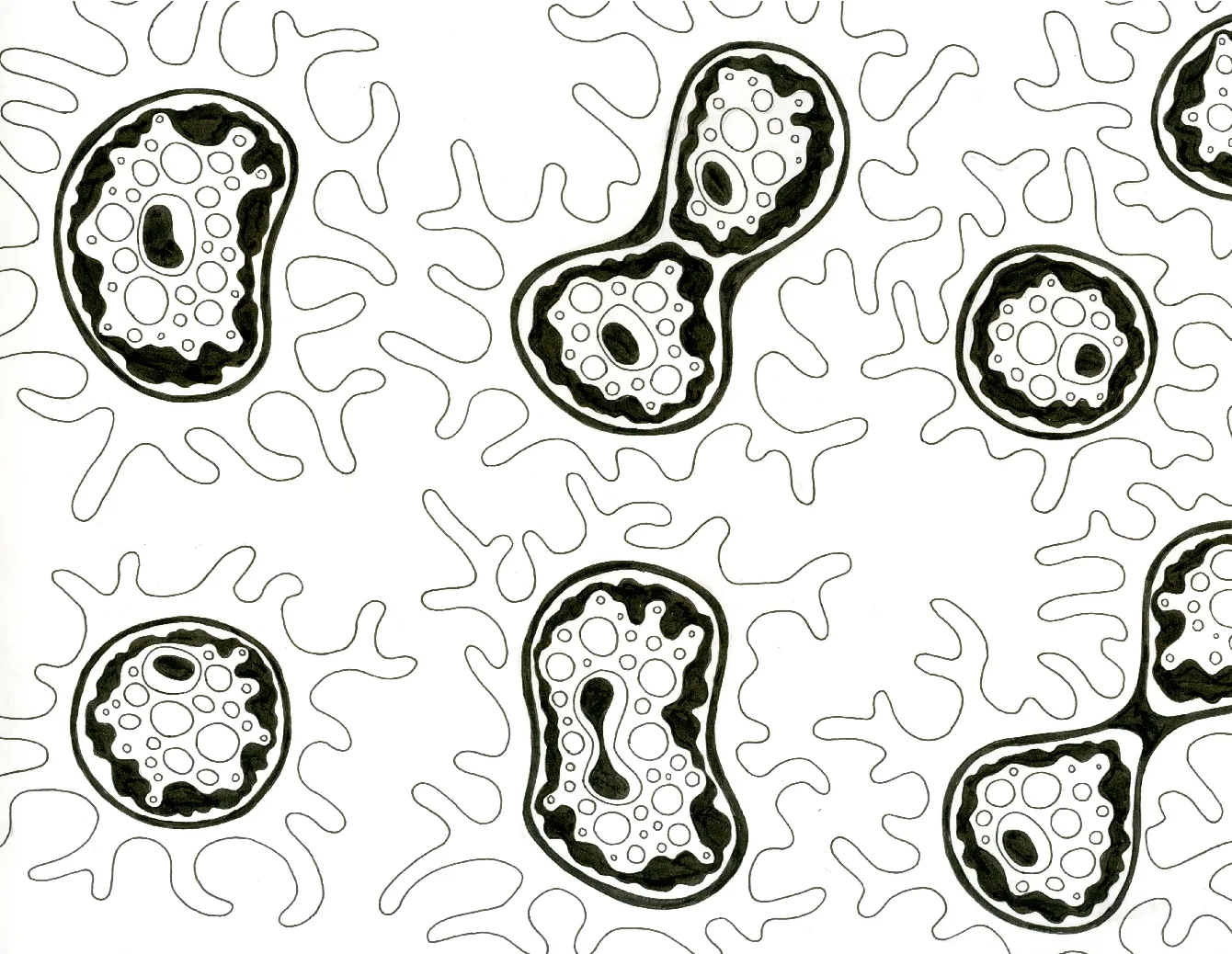
Exploring Cells in Tattoo Designs
I didn’t want to limit myself to a specific goal or outcome. Instead, I chose to explore what inspires me right now—tattoos—since I plan to intern at a tattoo studio next semester.
Recently, I’ve been experimenting with incorporating cells into tattoo designs. This concept offers endless creative possibilities. I’ve been inspired by images of microscopic cells and diseases, like those on MicroscopyU, and I’m developing designs based on them. For instance, tattoos of disease cells could serve as powerful symbols—like a cancer survivor wearing a design as a mark of strength. This concept extends to other illnesses, such as COVID-19, Cancer, or even STIs, allowing people to reclaim their experiences with pride and self-acceptance.
This exploration has taught me a lot about the artistic and emotional potential of tattoos. They can transform personal stories into powerful, wearable art. I’m still refining how I want to present these ideas, but I’m excited to share this meaningful project and take another step toward my future as a tattoo artist.
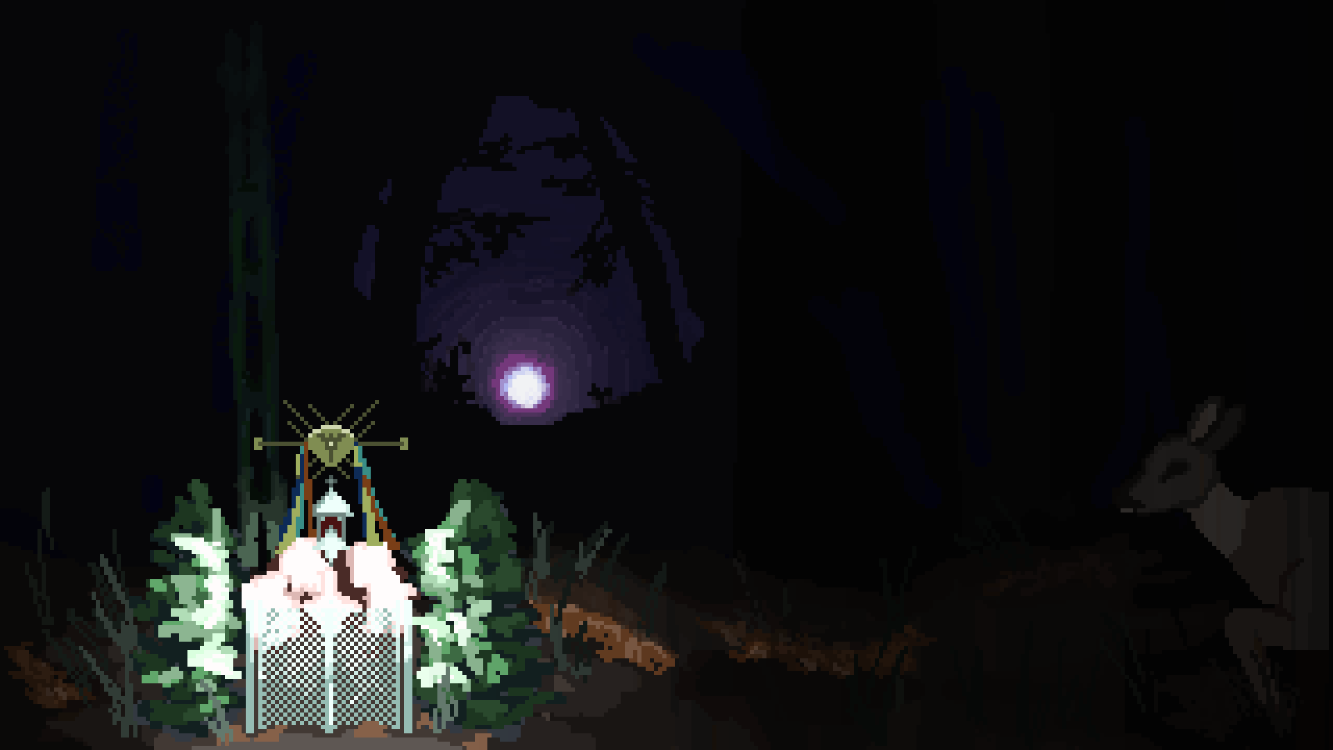
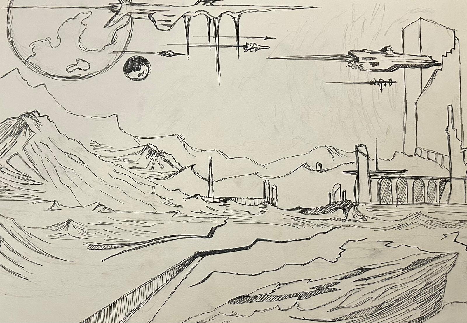
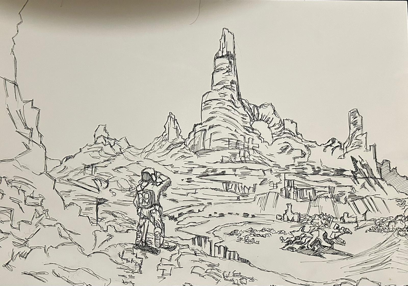
M.V. Todorova

(Under construction)
The theme of my project is a chronological series of visuals exploring humanity’s possible future. It’s not just about what could happen but also a way to think about the future we are making now. I want people to see it and feel the weight of our choices and the legacy we leave behind.
Here is how the series goes:
Robots and Humans - this is the first poster. It’s about how much focus we put on AI and creating technology. I want to start with this because it’s where we are now. There is a lot of sci-fi in my project, so I want you to keep that in mind.
Aliens and Humans - the second poster is about aliens coming to Earth. They represent the unknown and are a test of our humanity.
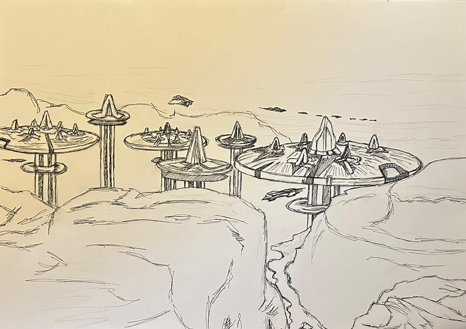
Futuristic Cities - the third poster shows the cities of the future. Imagine we created robots, then aliens arrived, and with all the knowledge and advanced technology, we built futuristic cities. But I want people to ask: Did we forget about nature while we were focused on all these other things?
Climate Change or Apocalypse - this poster is about climate change or an apocalypse. It’s to show how our choices can make things worse if we don’t focus on what matters, like our planet - our home.
Leaving Earth - the last poster is about leaving Earth and living on another planet. I want to show that even though we can fix our mistakes, the question is: Are we going to make them again?
Kim Naber
My name is Kim Naber, I’m a Dutch illustrator and I love to work with lots of color and different media. I’m also a writer so I love to combine text and image. I’m inspired by the little things in life, both sad and happy, femininity, complex emotions like grief or love and I enjoy exploring the contrast between a rose-colored, too good to be true, happy world and very real, intense or explicit topics.
Contact information:
Email: kimototi@gmail.com
Instagram: kimnaber.art
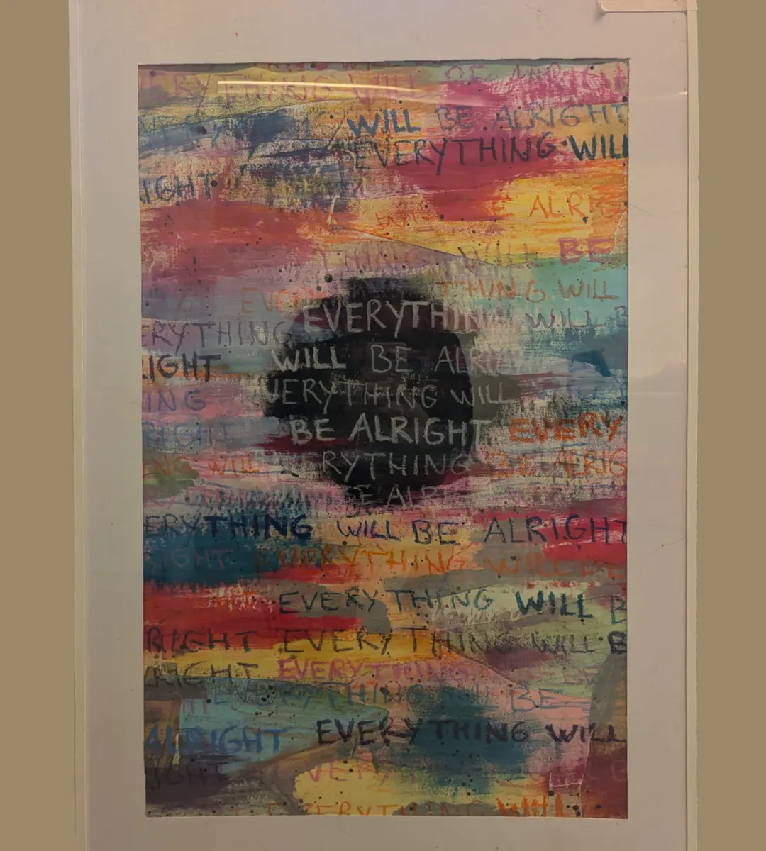
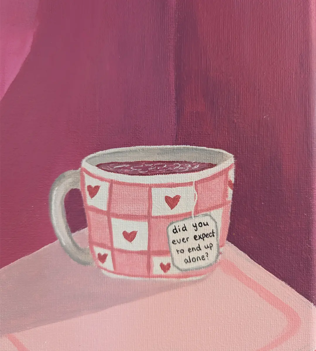
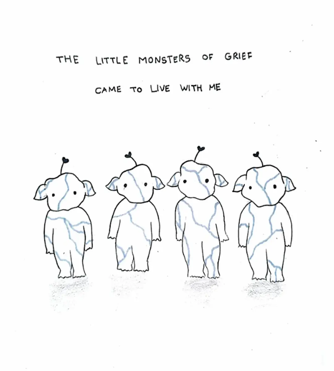
For this project I decided to work with the topic of grief. I tried to challenge myself to express my emotions through art. My main focus has been showing the more positive and hopeful side to grief, as well as the realness, sadness and unexpectedness of loss. Death and dying are widely universal experiences that are inevitable within life, yet grief and loss are deeply individual and personal experiences. In this project I decided to show the way I deal with grief and loss, which is shown with lots of color, surprising contrasts and a combination between text and image.
Britt Gerdes
My name is Britt, and I am 22 years old.
Ever since I was a little girl, I always enjoyed drawing. At school, at home, everywhere. My teacher when I was four told my mom that I already drew hands on a puppet instead of a few sticks. And when I was 12 my teacher let me draw into every booklet I had. After middle school I had to choose what I wanted to do. Working in a laboratory was something I always dreamed of. I had a little laboratory kit and could do all these things at home. Even though I wanted this, I decided to go to study Graphic Design, something I also found interesting. In the last year of this study, I had an internship with an illustrator who showed me what art really is and what you can do with your creativity. He showed me the spark I always felt for art and creating things and gave me the motivation to apply for Minerva. And now I’m there, I am happy, and I love creating.
Dreams are a fascinating mix of thoughts and feelings that come to life while we sleep.
This abstract work explores the mysterious world of dreams, using bright colors, flowing shapes, and contrasting elements to capture their ever-changing nature. Dreams can be clear and vivid one moment and then fade into something uncertain and strange the next. This artwork reflects that unpredictability, showing how dreams can bring together memories, hopes, and fears in unexpected ways. The use of light and shadow represents the balance between the comforting and the unsettling parts of dreaming. By looking at this piece, viewers are encouraged to think about their own dreams and the hidden stories they hold. It’s a reminder that dreams, though puzzling, are a special and important part of being human.
Ria Krizan
Reitz is a 24 year old artist originally from Zagreb, Croatia. Current focus of her art is capturing the human reality through different mediums, such as video, photo, and animation.
Contact information:
Email: aernazirk@gmail.com
Instagram: aernazirk
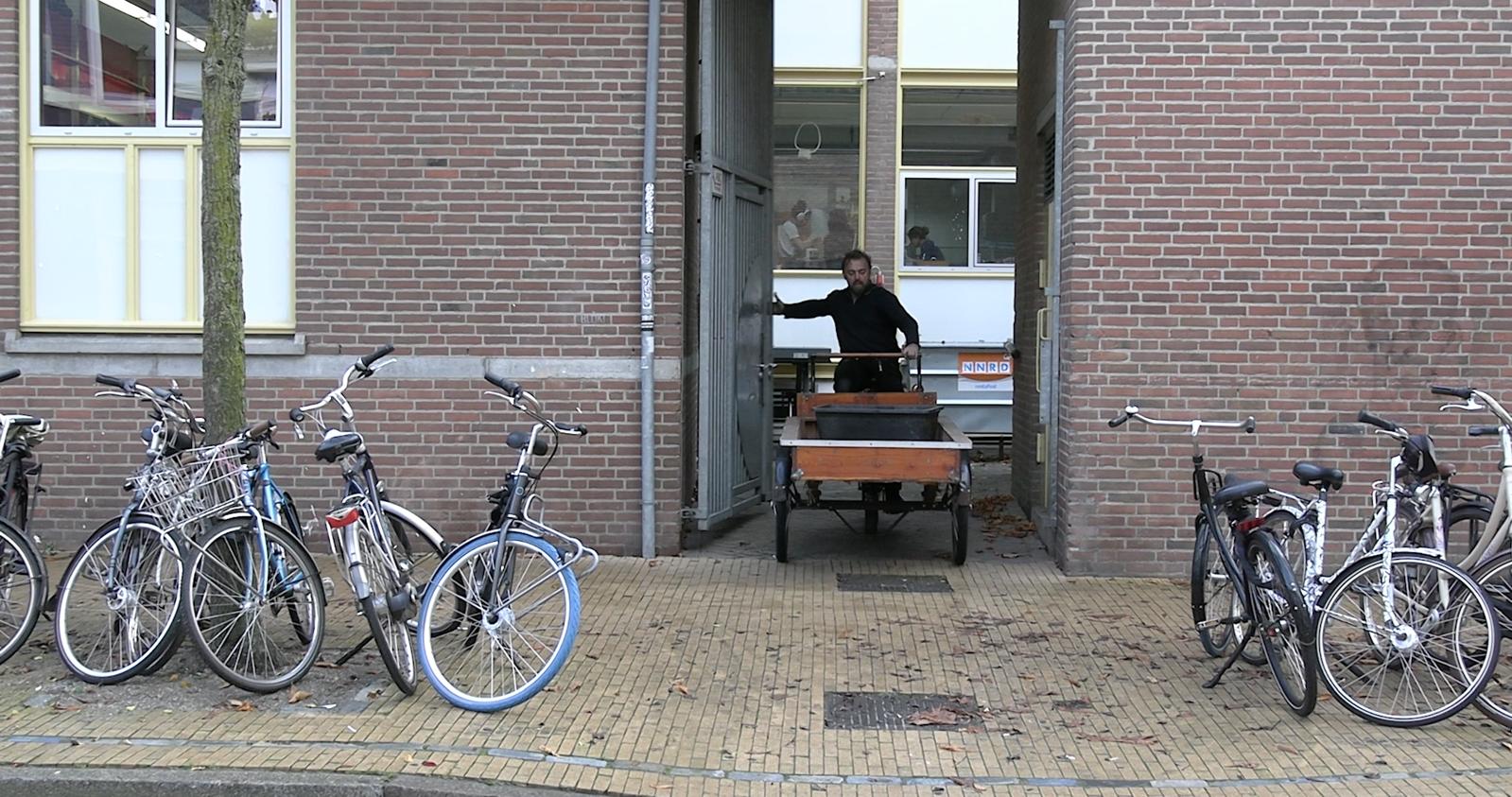
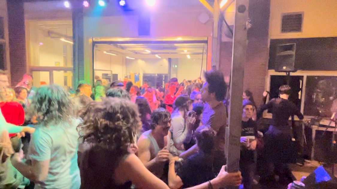
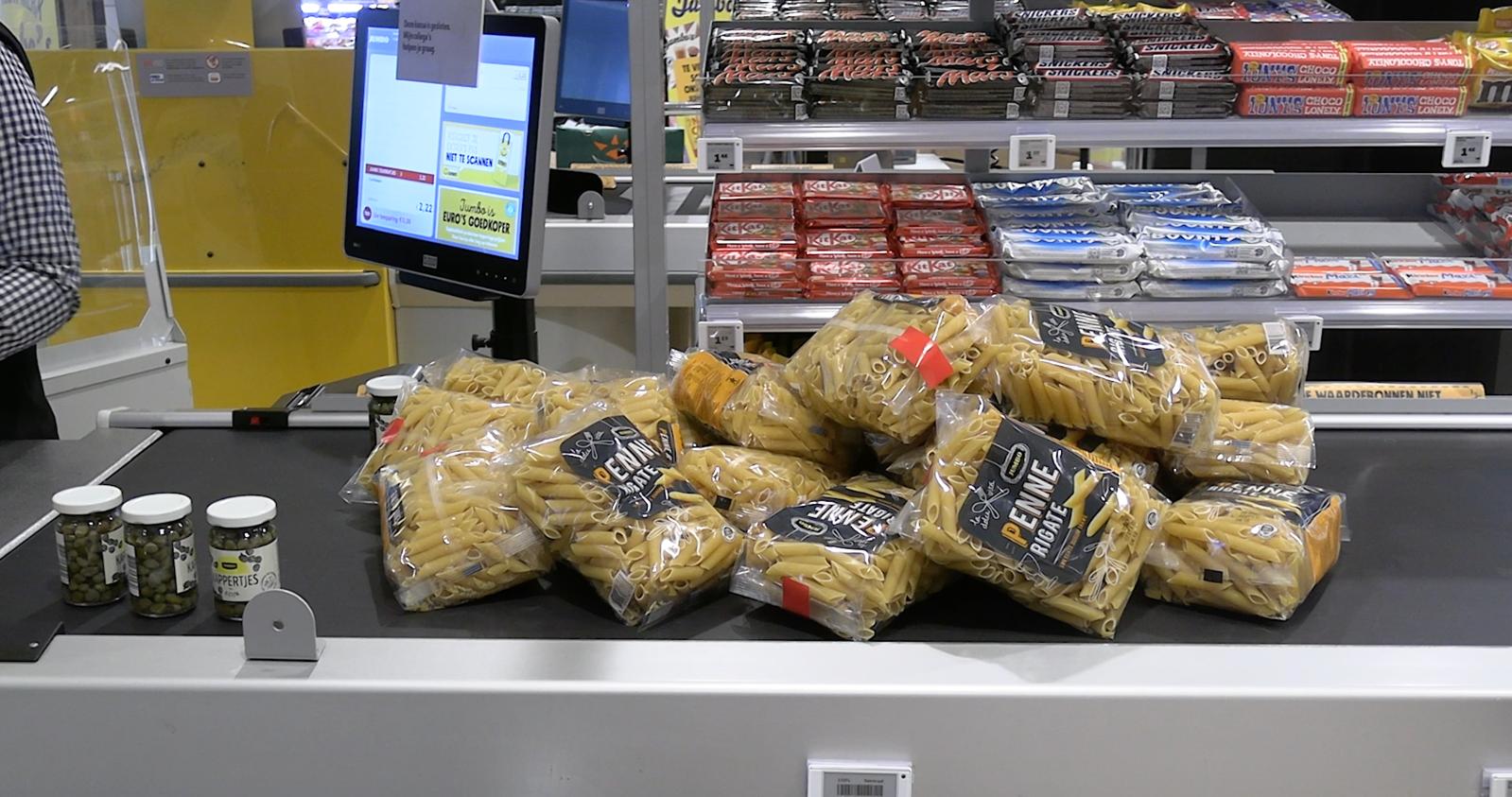
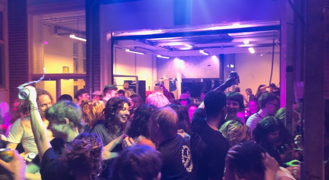
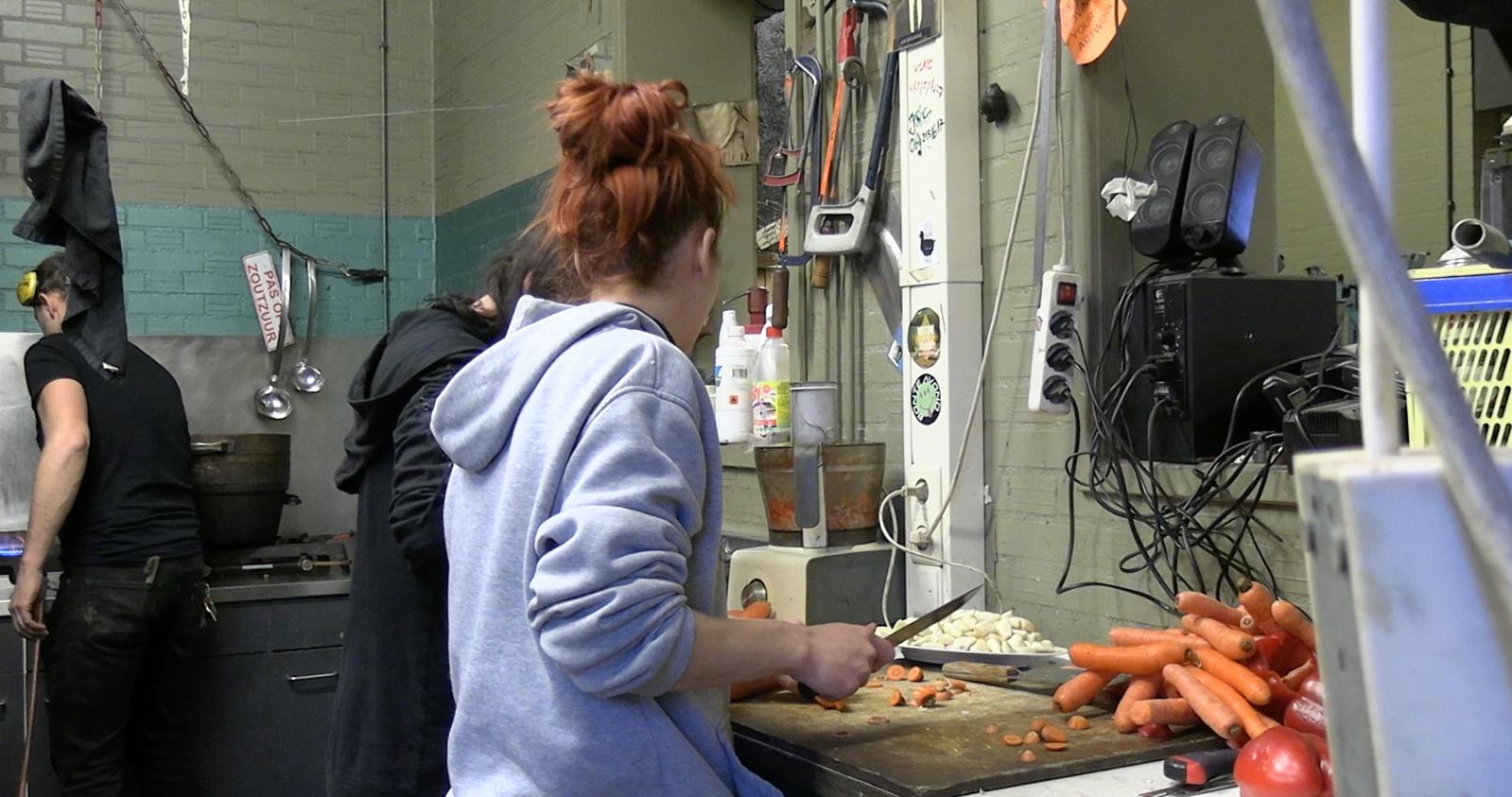
‘Thursday dinner’ is a documentary film taking place in the Minerva Art Academy in Groningen. The film follows the journey of the dinners taking place every Thursday for 10+ years now; pasta for 1 euro, later beers, song and conversations. It documents the value and persistence of the community, and the people carrying said community.
Community is an essential part of the artistic journey, especially for art students. The Thursday dinners, barbecues and concerts offer students an opportunity to eat well, meet new people or catch up with friends, and have fun in a safe environment. The energy of being surrounded by like-minded individuals—each with their unique visions and challenges— creates a dynamic environment that fuels inspiration and motivation.
Equally important are the teachers who understand and prioritize these values. These people go beyond simply delivering lectures; they actively cultivate spaces where collaboration and connection are not just encouraged but are built into the fabric of the learning experience. They recognize that art is not just about technical mastery, but about nurturing the growth of individuals within a collective, where everyone has something to offer and receive. These teachers make sacrifices—whether in time, resources, or energy—to ensure their students experience the power of community. Their commitment helps shape the next generation of artists not only as skilled professionals but also as people who understand the importance of sharing, supporting, and growing together.
This documentary was made as a celebration of incredible teachers and persons, and everyone who was and is a part of this community.
Viktoria Valcheva

I draw mostly with graphite or gouache. I have no social media where i show my drawings.
Contact information:
Phone: +48600108802
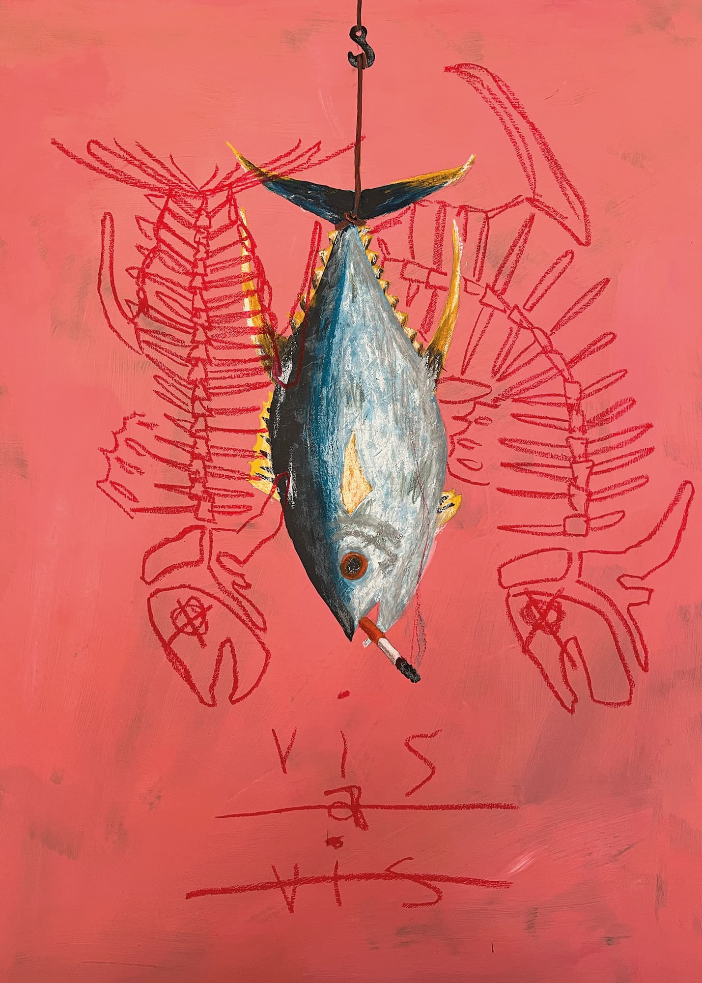
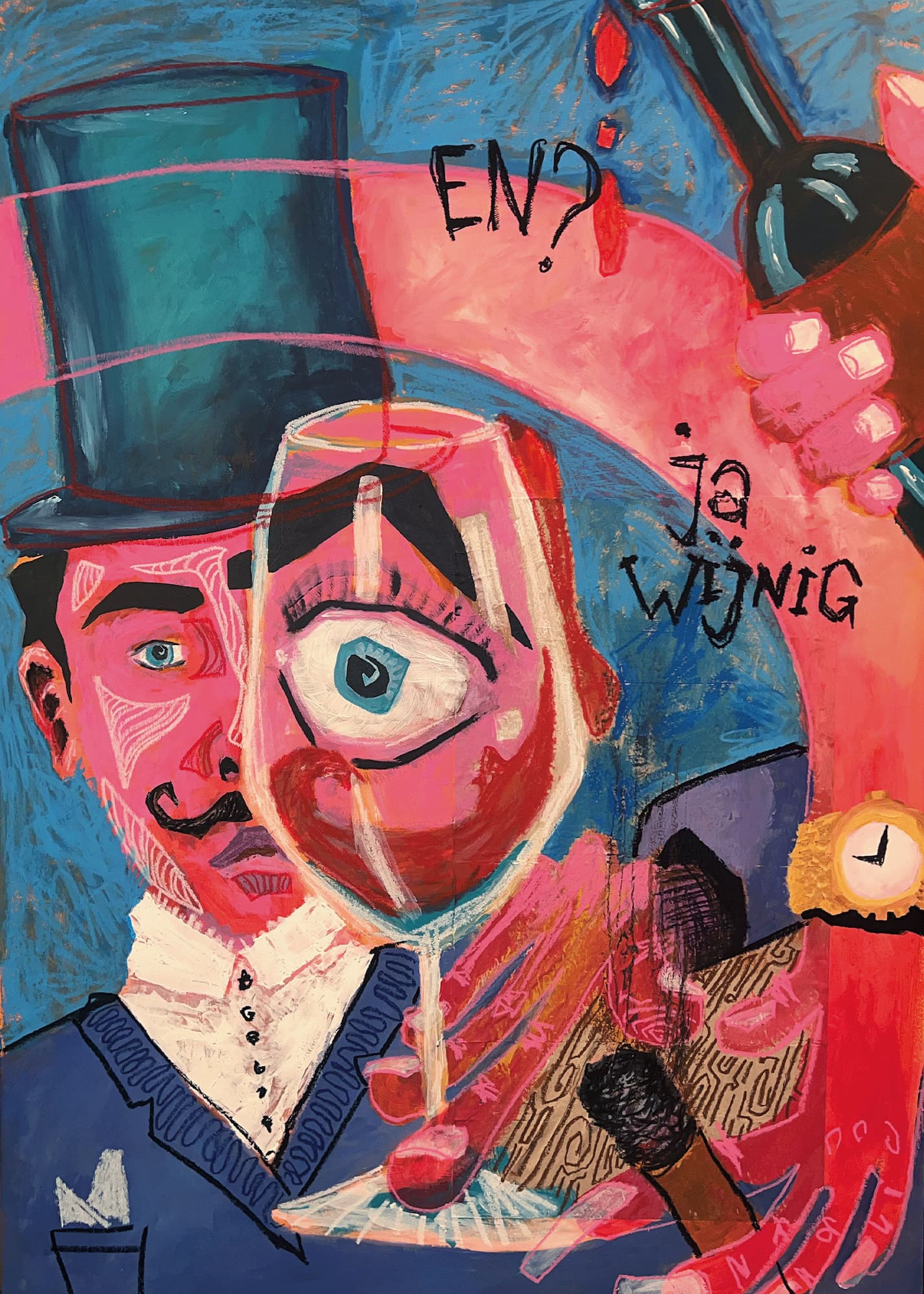
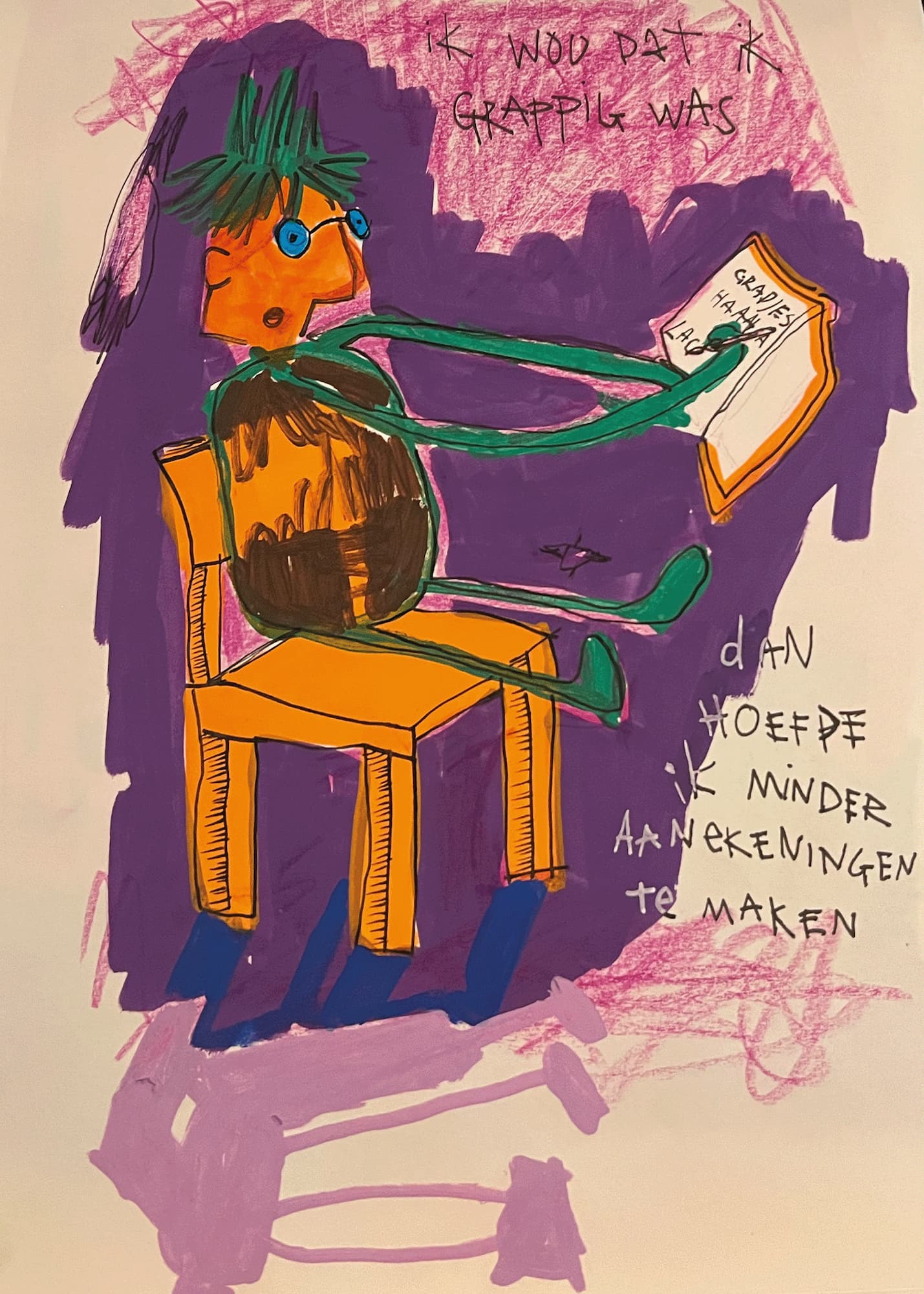
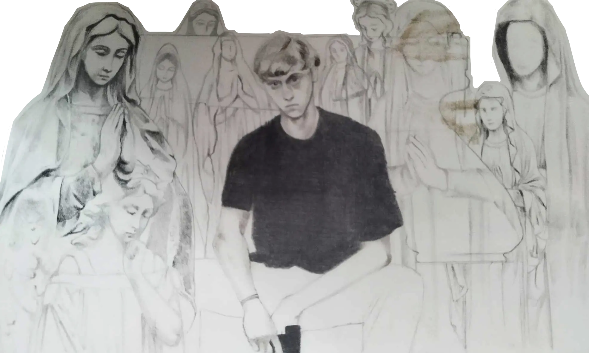
My project is about domestic terrorists, and I want to look deeper into their psychology.
People say that they are monsters, but monsters don’t exist; they are human beings with
complex inner world, thoughts, feelings, ideas, concepts, philosophies. To dismiss their
entire being and inner machinations as “monster” severely undermines what humans are
capable of. Who wants to think that their peer, their friend, their family member, their
neighbour, their old classmate can do such a thing? But how does one even come to such
a point? Where is the breaking point? Where is the point of no return? Where is the despair
horizon?
I want to follow the evolution of their thinking and what led them to do what they did.
Because it is never as simple as it looks on the outside. People aren’t born with hatred and
extremism in their hearts. These are feelings that grow and evolve over time. How does that
happen?
Everybody was a child once. And all of them martyred themselves for the cause.
I am merely looking at these people and seeing them for the humans they are – I'm
humanising them, something nobody ever did. I am seeing them for the complex individual
with a convoluted inner world and confusion, that eventually manifested itself in their
actions.
Robin Sieben
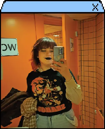

(Under construction)
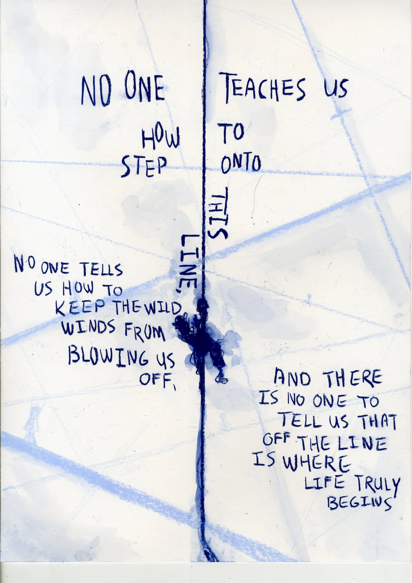
THE STRAIGHT LINE
I am twenty years old when I reach down and attempt a comforting hand on their shoulder. At twenty years old they would expect me to have all the answers ready, for me to serve them as a guide which they have lacked. For no one teaches us how to step onto this line, no one tells us how to keep the wild winds from blowing us off, and there is no one to tell us that off the line is where life truly begins.
So, we sit there in silence, too many questions and too many unhelpful answers.
Will it get better?
Oh no, absolutely not, it gets worse, but in a good way.
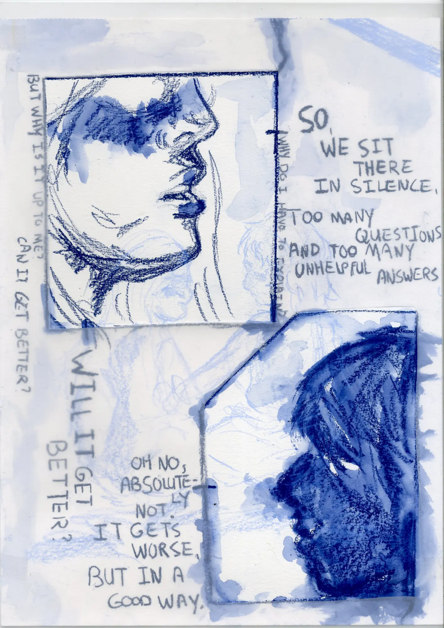
Isn’t it a cruel thing in the world? To put our children in front of it, tell them all these great things about what is to be experienced on it, but to never go back, to never retrace their steps. For it is a singular, clear, line and returning serves no purpose than to waste time. And what could be worse in our lives than to waste time?
I am twenty years old and when I look towards them, I see them as vulnerable as can be. A vulnerability I tell them to hold onto,
Everything we do as humans comes from vulnerability, we spend most of our time vulnerable and yet we devise ways to override this nature. Which is strange, from a young age we are taught to act against ourselves.
And isn’t that a cruel thing in the world? To tell our children to be themselves, that they will fit right in, that they must fit right in, and that to fit right in is to follow the line and when on the line the only uncertainty one will be faced with is the most certain thing in the world: our eventual death. So, we tell our children to keep their heads down, to not stand out, to be themselves, to do anything and everything but to stay on the line, and they will have nothing else to fear but death.
Except we didn’t tell them how, we didn’t tell them how to be themselves, we didn’t tell them what the thing to fit into is, and we curse them when they stumble. We curse them when they fear more than just death, for they must have discarded our one instruction, the one instruction meant to keep them safe because we love them.
When I am twenty years old, I say,
Don’t hold onto that anger, I have spent so much of my time holding an anger close to my ribcage and all it did was ensure that there was no place for anything else. That that space was for anger and resentment only, anger about what they would call me and resentment about what they failed to understand. But that made me as bad as them, if that is even a correct word to use. I insured that they would never see me as me, because I never showed them how to.
But why is that up to me? Why do I have to explain, and to explain, and to explain and hopelessly hope that somewhere along the lines something sticks? Why do I have to go through that anger and shame time and time again every time I lose sight of where to go?
Because shame is an utmost human thing, and you should never be afraid to be human.
But what if I’m afraid to be me?
Then once you give somebody the space near your heart, they will take a piece of you back with them. What they do with that is up to them, but some of them will hold it close to their heart, and they will give you the tools to live with that fear. They teach you that there is so much more to us than keeping our heads down and following the road. They will show you all that is to find beyond the border, and by then you will have left behind a piece of you with so many others that that fear is forgotten somewhere along the way. And you will realize that the line was never meant for you, that you were cursed from birth by many things to walk a different path. And that path might at times be scary and uncomfortable, but you will not walk it alone as long as you are you.
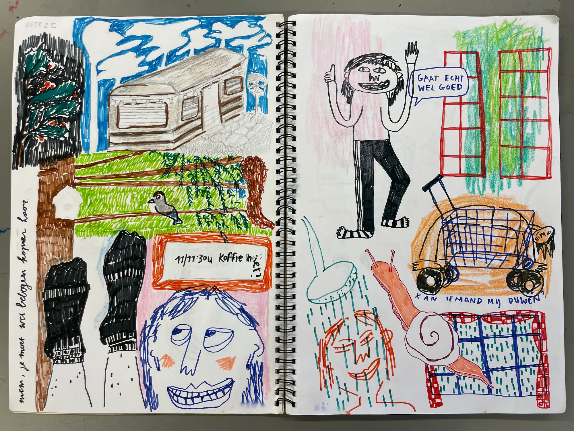
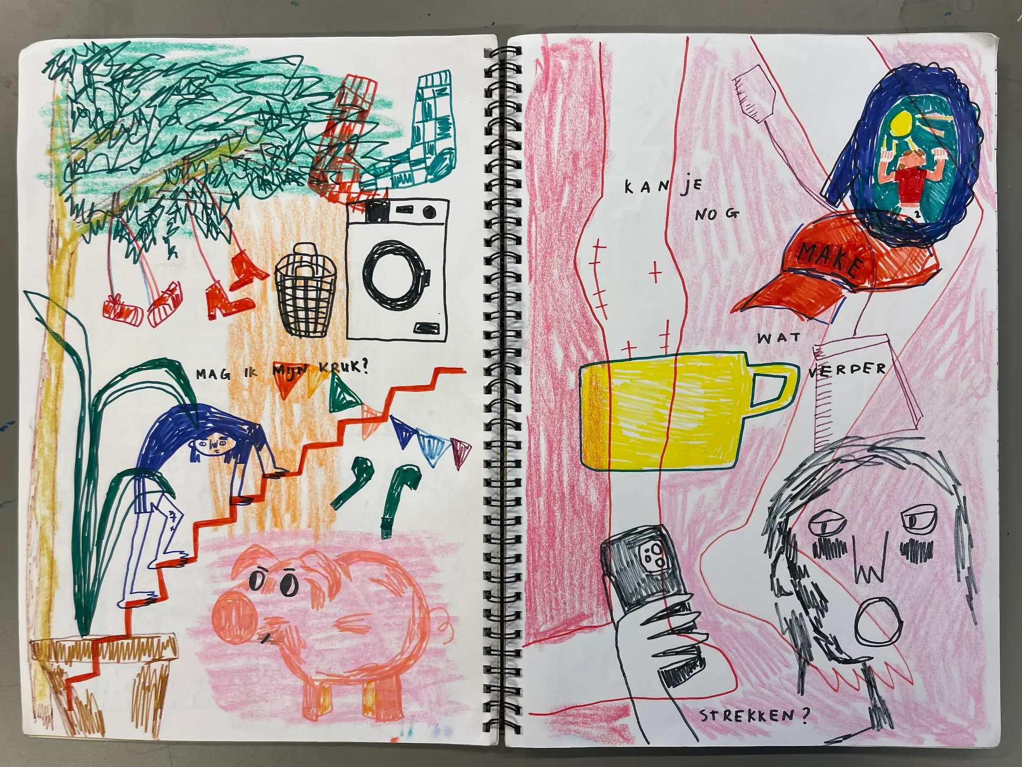
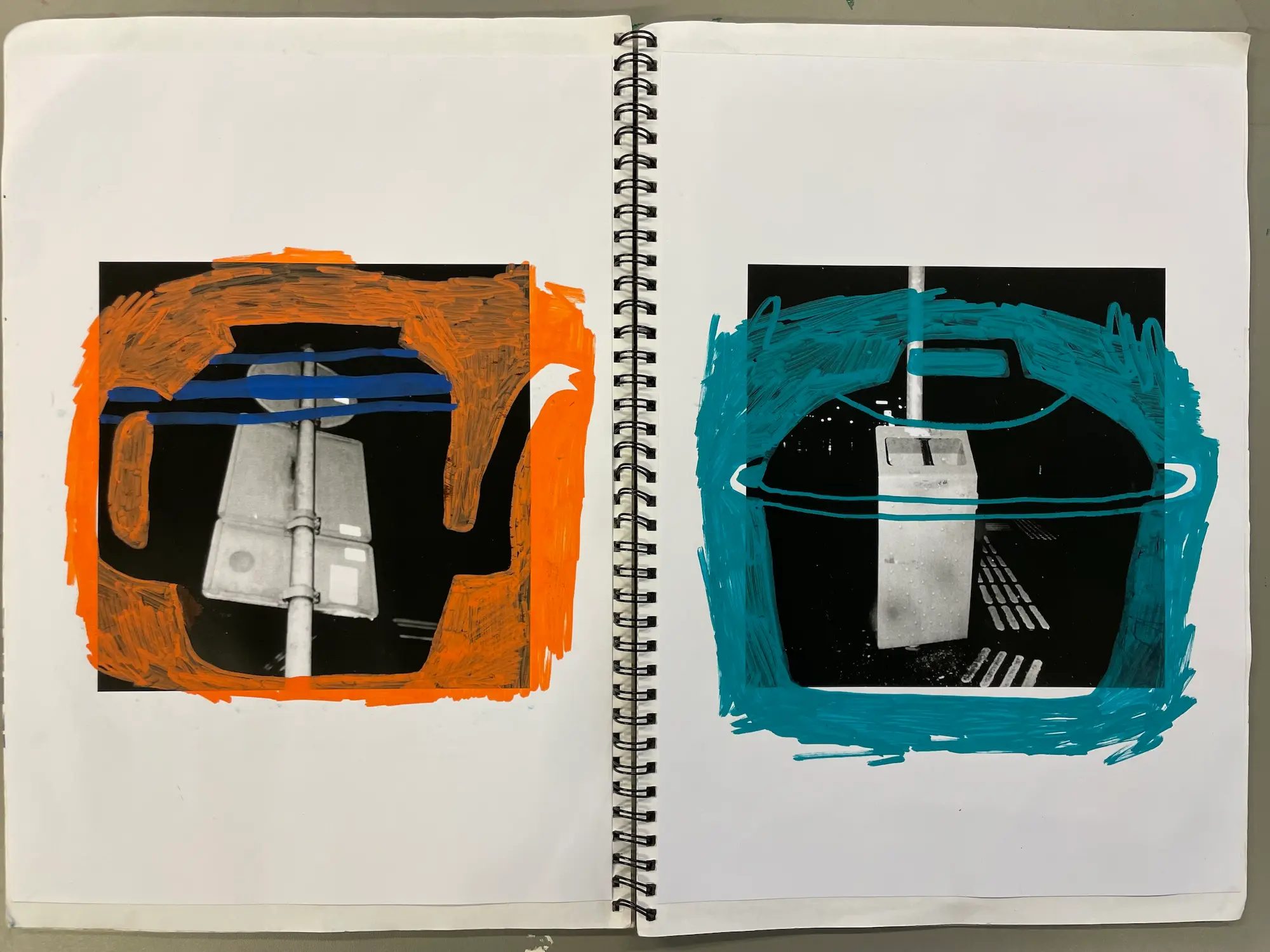
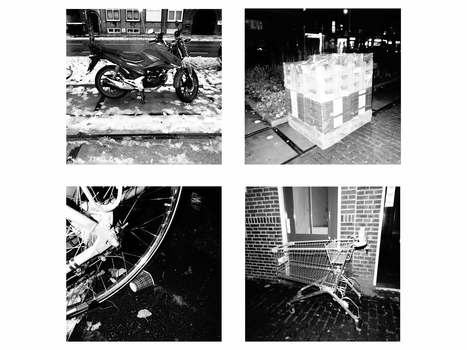
Bente van Spijk

Hoi, my name is Bente van Spijk. I’m from Groningen and have always lived in villages surrounding the city. My interests lie in highlighting the ordinary moments of life and finding the humor in everyday situations, using abstract shapes and bright colors.
Contact information:
Email: bentevanspijk@gmail.com
Instagram: vanspijkbente
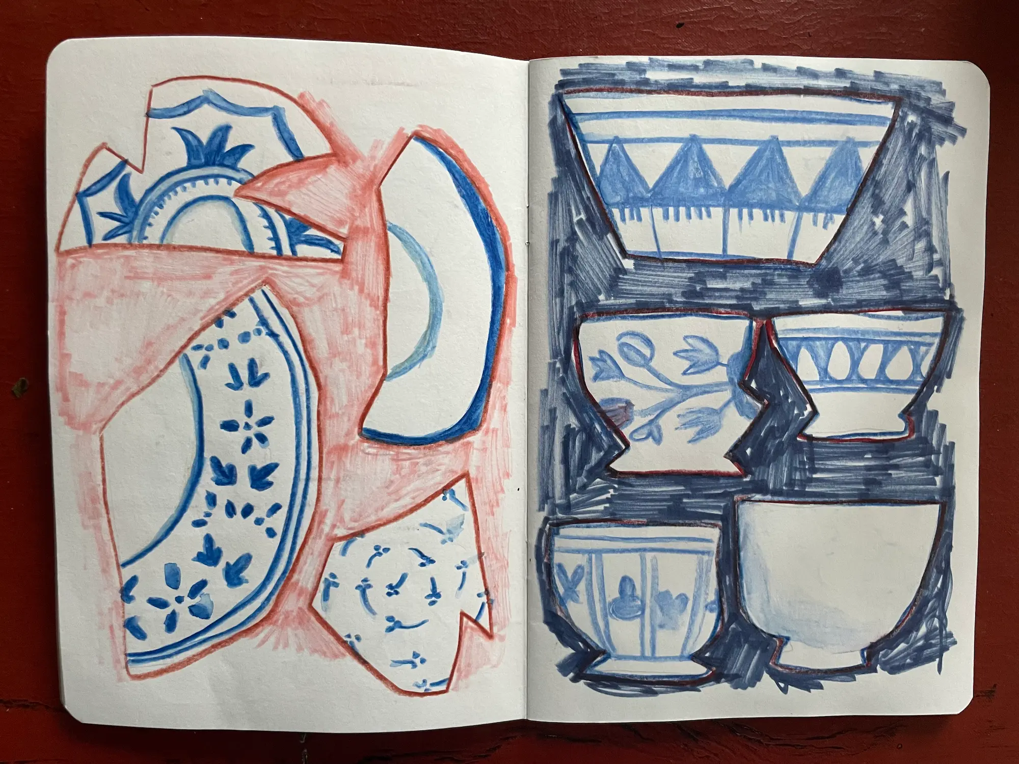
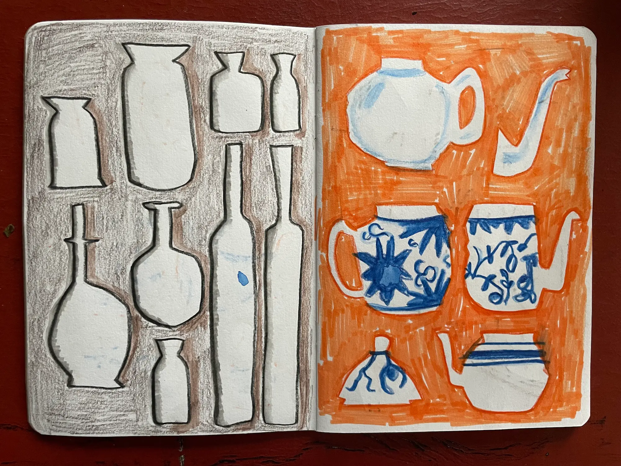
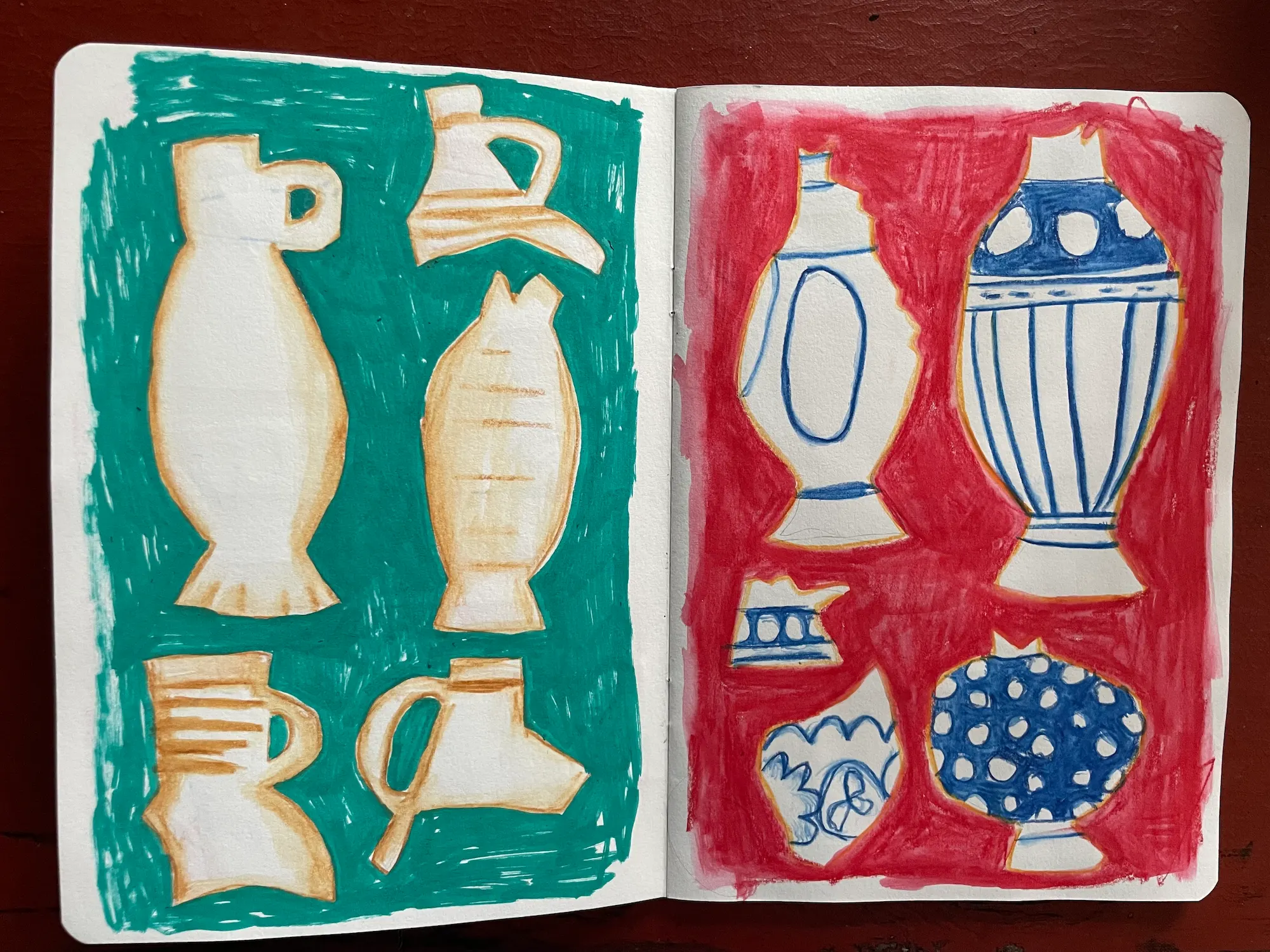
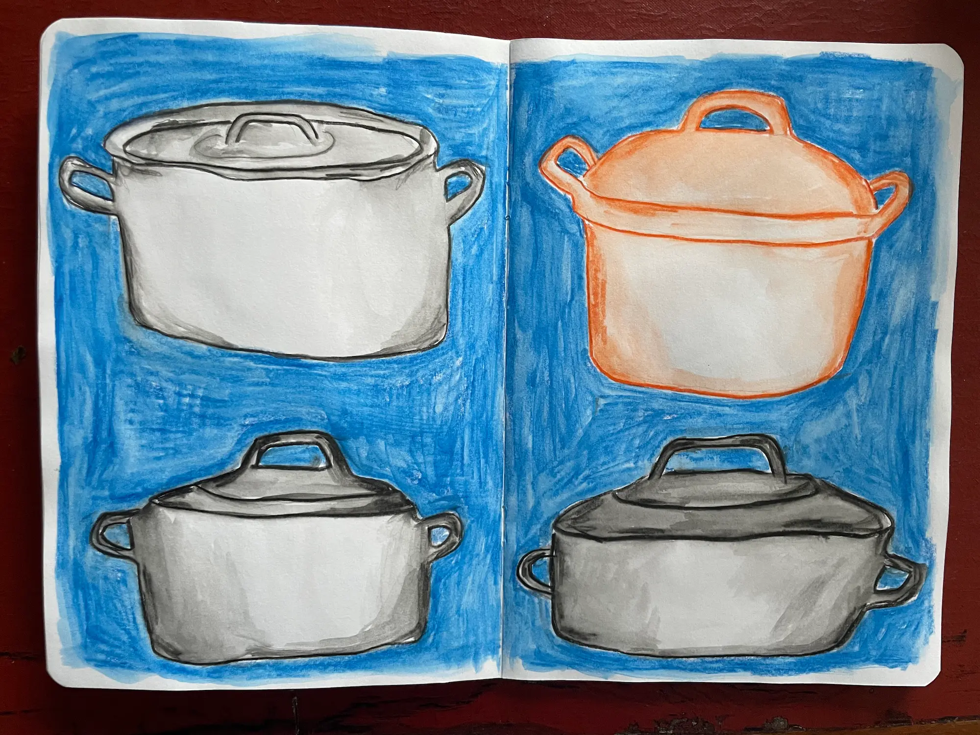
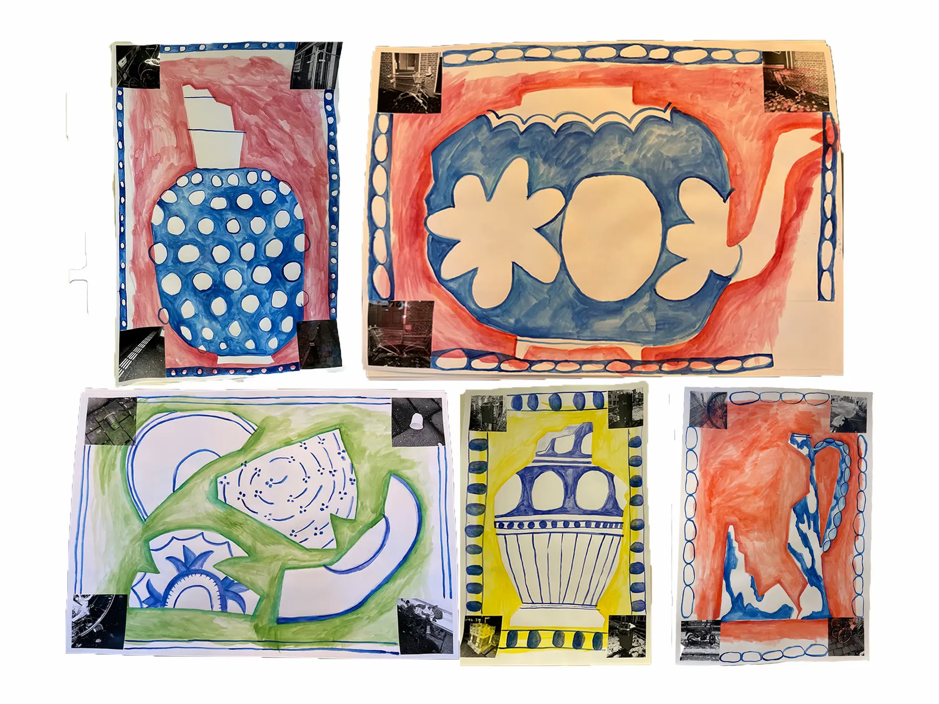
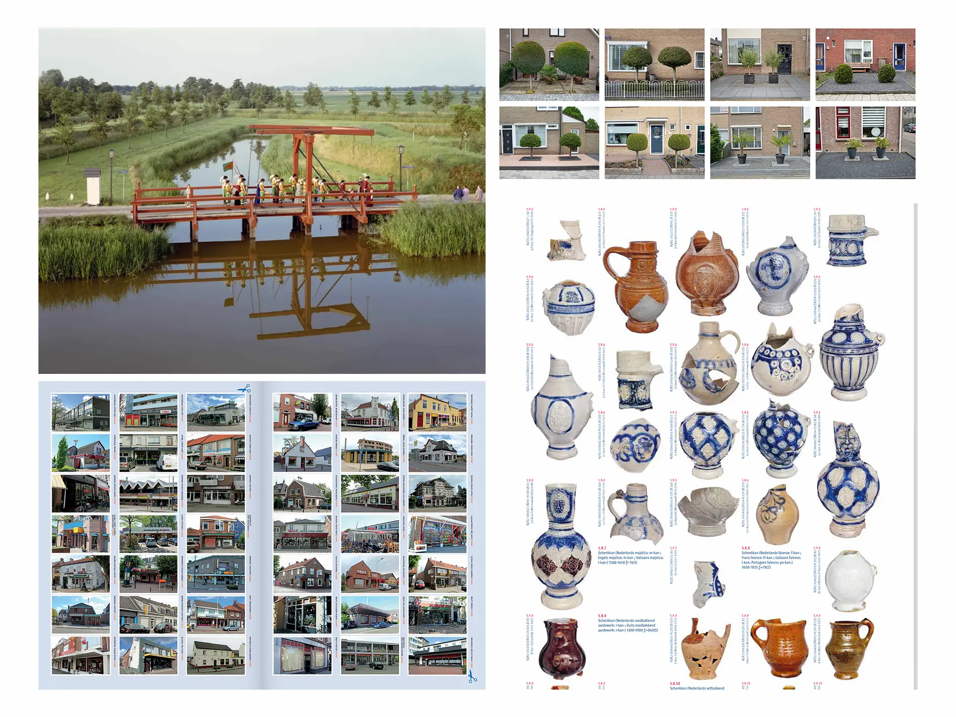
Verzamelen
"What do you want to leave behind in this world?" This was a question I asked myself, but it felt too vast to grasp. So, instead, I reframed it: "What has already been left behind?" As I looked around, I came across a book called SPUL (Dutch for "stuff"). It’s an archaeological collection of discoveries made during the construction of the North-South Line in Amsterdam. The collection featured old items like vases alongside newer ones, such as plastic forks. I was fascinated by the pages, not only for their aesthetic appeal but also for the way they communicated the stories behind the findings.
At the start of this semester, I underwent knee surgery that left me unable to walk for six weeks, a period that felt extremely long for my mental and physical well-being. When I was finally able to go outside, I could only walk very slowly. During these walks, I became fascinated by the things people had left behind on the pavement: bicycles, paper cups, shopping carts, and more. I began photographing these objects as if they were my own archaeological discoveries.
As I began curating collections, both my own and those of other creators, I felt a sense of peace. Objects were simply presented as they are, authentic. For example, in the book SPUL, there are page after page of white pipes, each one identical yet all broken and thus unique.
I also discovered several photography books capturing typical Dutch scenes, such as Hans Aarsman’s Hollandse Taferelen, Jan Dirk van der Brug’s Typisch Nederland, and Mark van Wonderen’s Collectie CHIN. IND. SPEC. REST. These books feature image after image focused on the same subject, creating spreads that are both humorous and aesthetically pleasing.
As I continued making these discoveries, I began creating my own collection of "stuff." I started combining the objects, allowing these completely different items to interact. It made me reflect: What have we, as a species, already left behind, and what are we leaving behind now? In the most literal sense. I aim to create a sense of calm by highlighting familiar objects and repetition, and by showcasing the ordinary in a rapidly changing world.
Arnold Doornbos
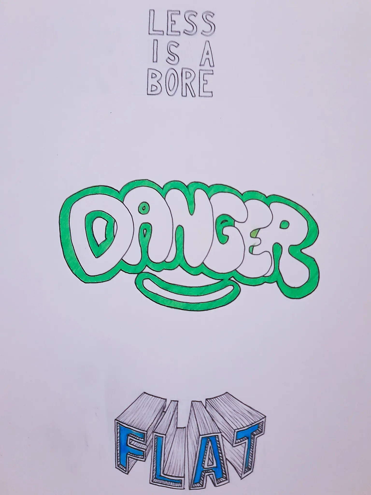
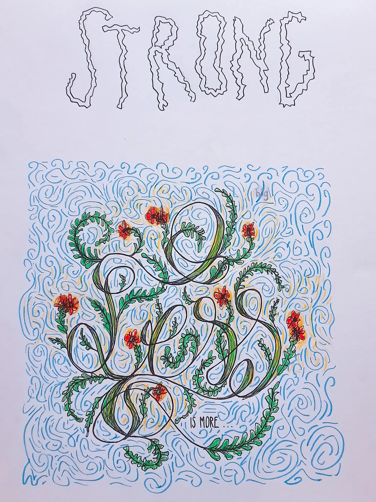
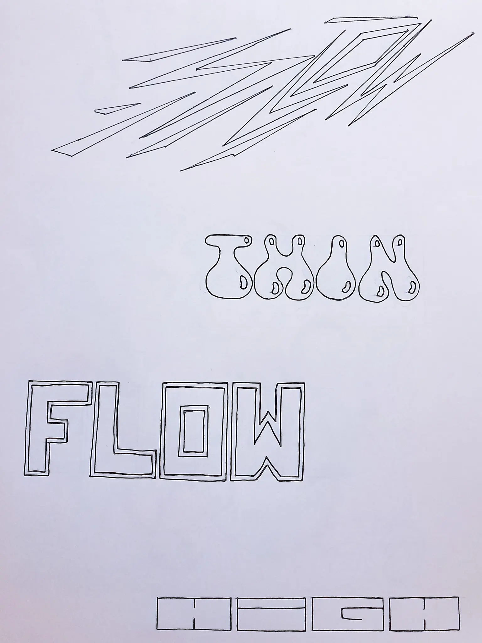
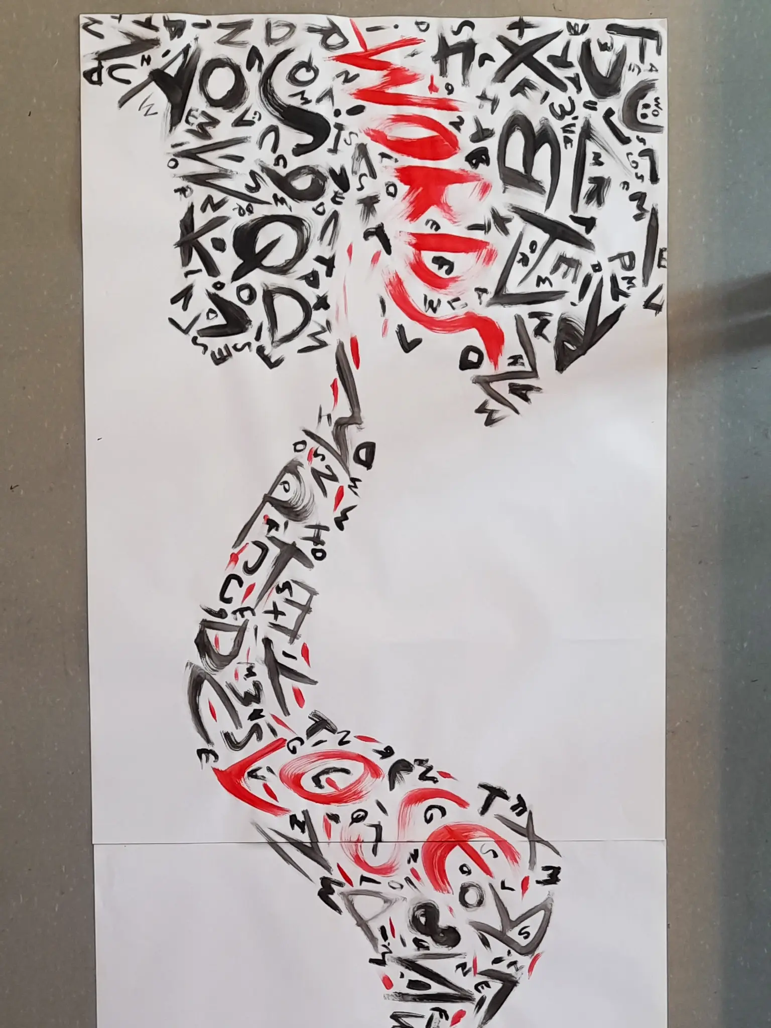
Hey there, my name is Arnold Doornbos. I am a Groningen based designer and I'm currently in my third year of studying Design at Academy Minerva. I also just started my own company: Arnold Design. As an illustrative graphic designer, recognizable, unique and meaningful design plays an important role in my work. My internship at Bureau DRP in Assen next spring will definitely help with developing me and my work further. Currently, the main focus in my work is on combining illustration and graphic design and making use of both story as well as strong visuals.
Contact information:
Email: arnolddesign2024@gmail.com
Instagram: arnold__design
Website: https://arnolddesign2024.myportfolio.com
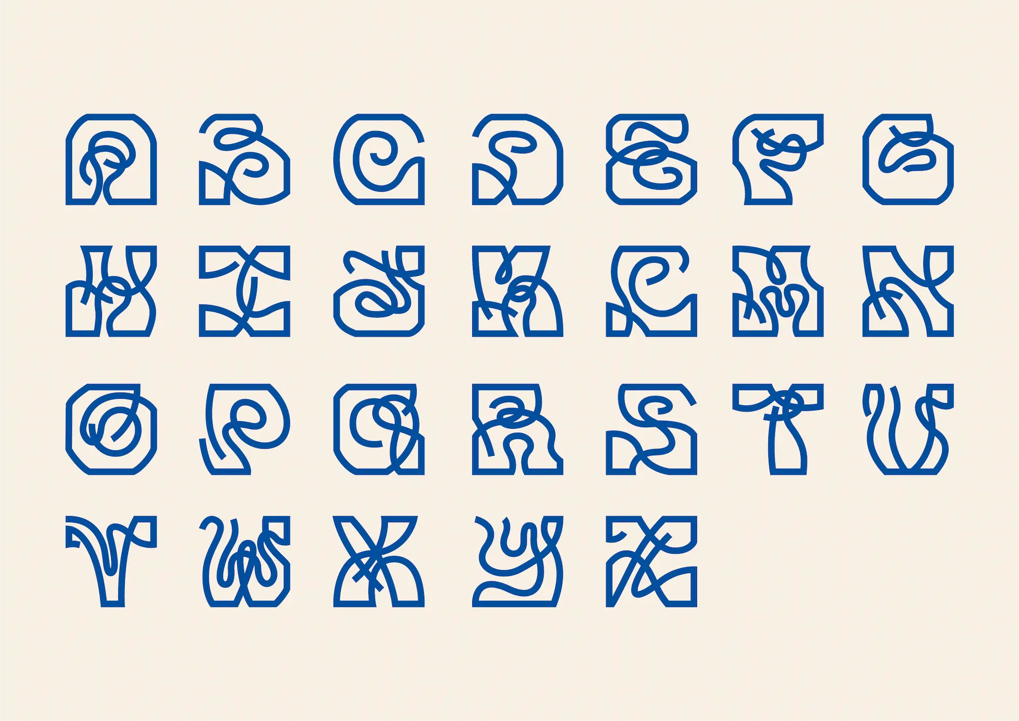
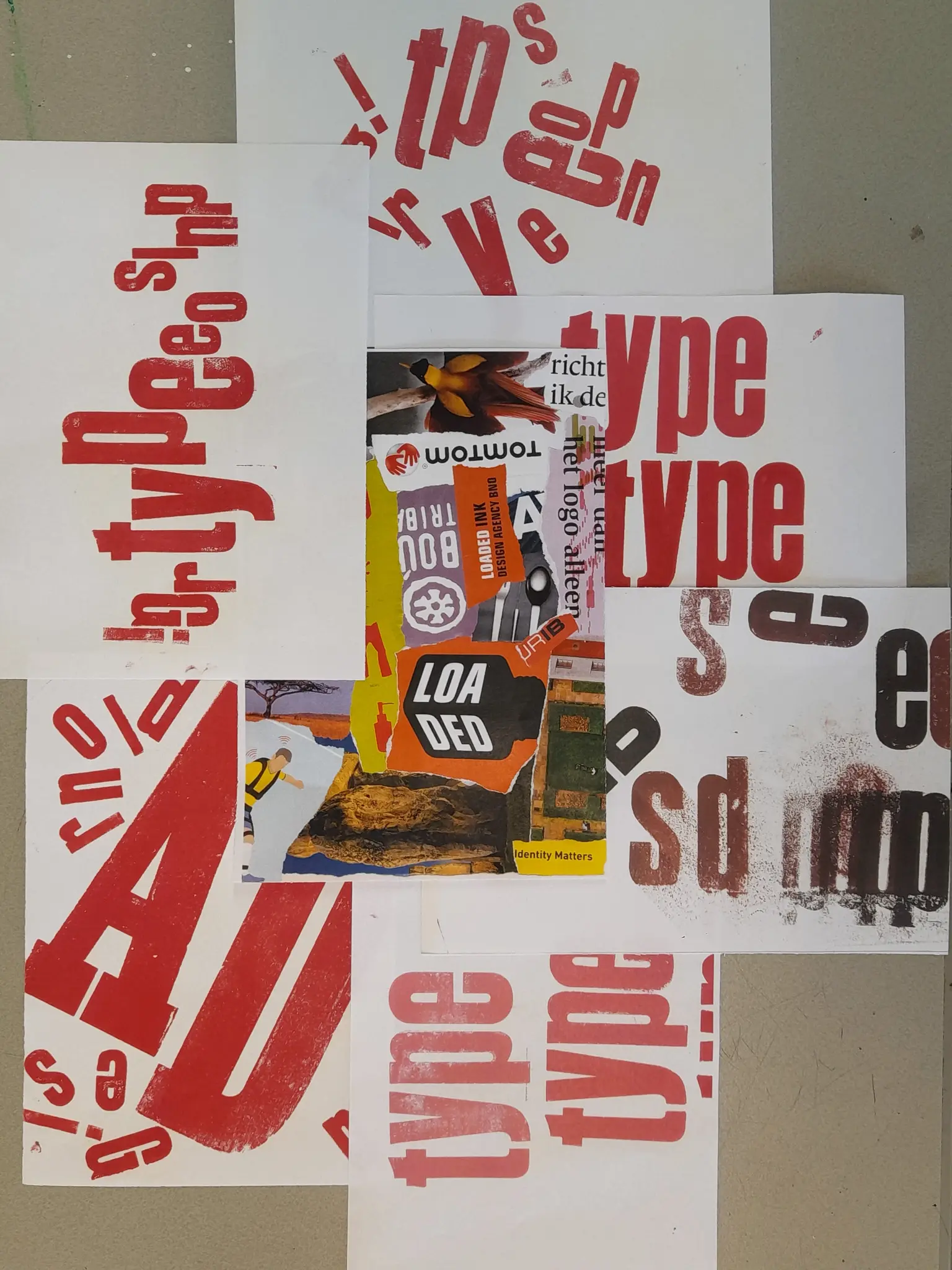
Introduction
Finishing second year in graphic and continuing third year in illustration, there was a theme that hung in the back of my mind constantly: typography. From the works that I made and the reflection that the teachers gave on my work, I figured that I could improve on the use of typography in my design. I have grown as a designer in many ways already, but there is so much more to figure out. I decided to take on this challenge and see what I would come up with as an elaboration of this. There have been multiple stages in my process to a final project, and even as I am writing this I’m quite in the middle of it.
Work at school
Working on my project at school, I arrived at the following issue: what is the meaning of a design, and when does it lose its meaning? From this point of view, I started working very abstractly and experimentally. I worked in the letterpress, playing with composition and colour. I started working big and expressive, using paint as a major material and trying to lose the idea of planned designing, but rather let the moment and material initiate the outcome of the design. These were not so much to find answer to the aforementioned questions, but rather to create distance to my normal analysis of design, and the usual answer that would, at first glance, come to mind. Normally I would think of an answer or explanation and then work it out practically, but this time I put aside my thoughts and tried to let the practical experiments do the work.
Choosing a theme
If it was at my own decision, or more as a means of embracing the assignment given to me during studio class, I thought of a theme that would contribute to my work. One of the things that I have learned during my time as a designer, is that art always includes a little part of the artist himself. I think this counts for design as well. To make design personal is to give a little bit of yourself to your work. Keeping it abstract and without any deep meaning, will result in a design that doesn’t really speak to people and doesn’t attract them at a level that is beyond the appreciation of the appearance.
This idea in mind, I decided to look closer into my own life. I found out several things that make me who I am, things that I’m proud of, things that make me insecure. One theme stuck to me. It turned out to fit almost perfectly with the ideas and questions that I had already tried to deal with during my experimental phase: Speech Impediment.
Now this is something that I’ve been thinking about for a while. I actually had a small presentation about myself in my student association friend group, in which I opened up about things that I dislike about myself. Speaking it out made it more bearable, but also more of a thing that was really going on, instead of something I sub mindedly struggled with. This was during the start of the year. Coming back to the question on what theme to choose, I realized this was both the right assignment and the right time to elaborate on speech impediment.
What made it fit nicely is that, when one struggles with speech impediment, they might be either unable to convey the right message or even be entirely unable to be understood. The words they say might be interpreted wrong or just not understood at all. But in the persons mind, they feel like they know what they’re talking about, they feel like what they have to say makes sense, until they actually speak it out and it’s just a blurry mess. To not understand, or to misinterpret, is a consequence not only on spoken words, but also on several other means of communication, such as visual design. This is where the connection was made.
If I looked at the letters and drawings that I made during the experimental phase, I sometimes couldn’t entirely understand or decipher the meaning of it all. But did that signify that the work lost its function? What if I weren’t supposed to read the letters but rather see it as an abstract shape or a form that conveyed a different message? What if letters were just another form in the endless library of shapes? Did they lose meaning? Or did they not have any meaning in the first place?
Whether they did or not, the way they could be interpreted can also have a big influence on the meaning of the design. Instead of losing its meaning, it might be misinterpreted.
A viewer might read an entirely different message in the design than the designer had in mind. And the next viewer might come up with yet another meaning.
This issue was something that I wanted to translate into my project.
Decisions to make
During the midterm, I looked back on what I’d done, and where it had led me to. There were multiple roads presented to me, and I was granted with a lot of interesting tips and ideas from my classmates and teachers. Now it was for me to decide how to continue. I decided to work on my own font. I started with working abstractly, figuring out how to shape every individual letter. After finalizing every letter, I digitalized them and put them together. The next thing for me to do is, working these letters out into actual designs. Because I have not finished my work at the moment that I’m writing this, I cannot make any conclusions on my work. But if you are interested in how this turned out, stay tuned…!
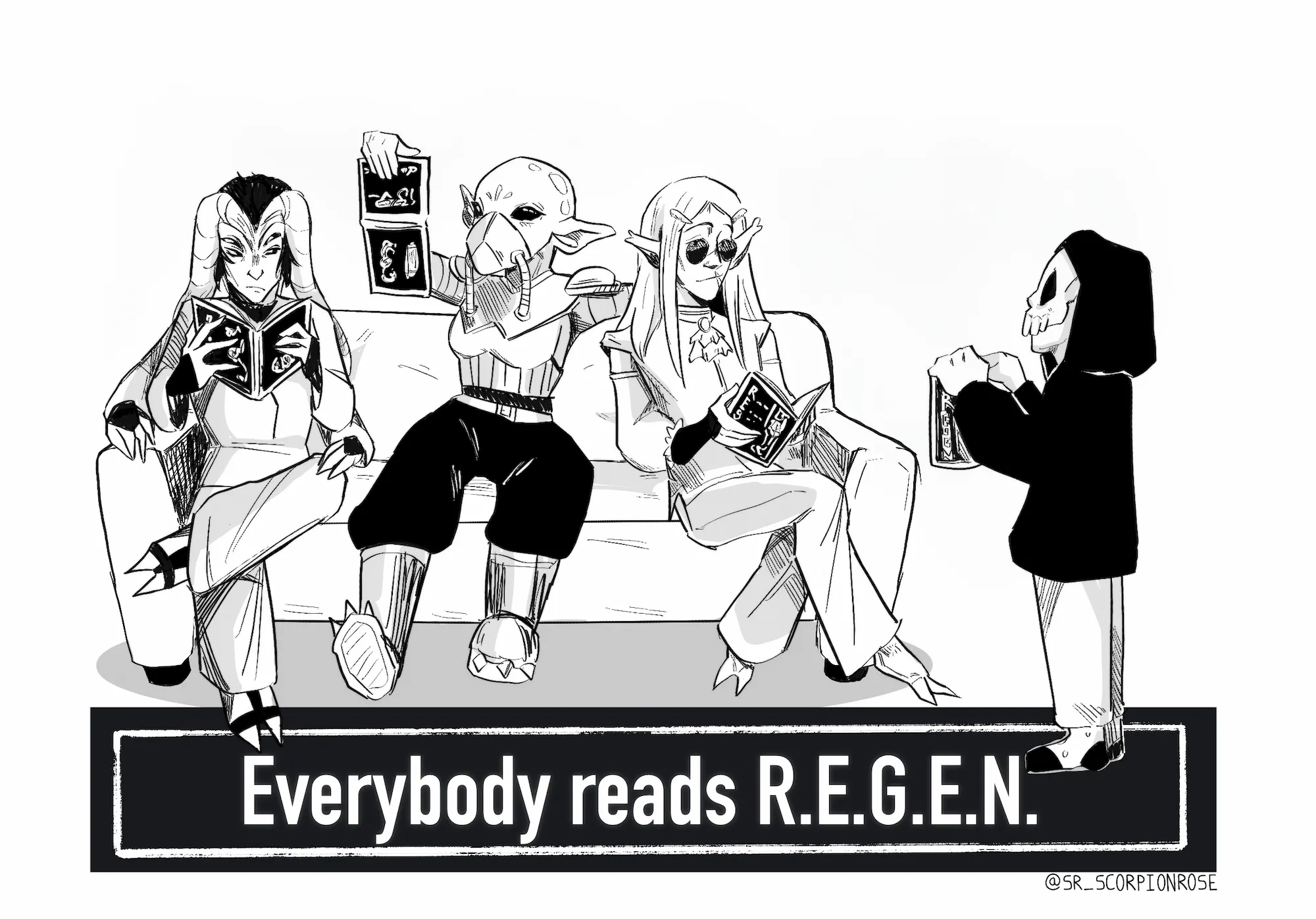
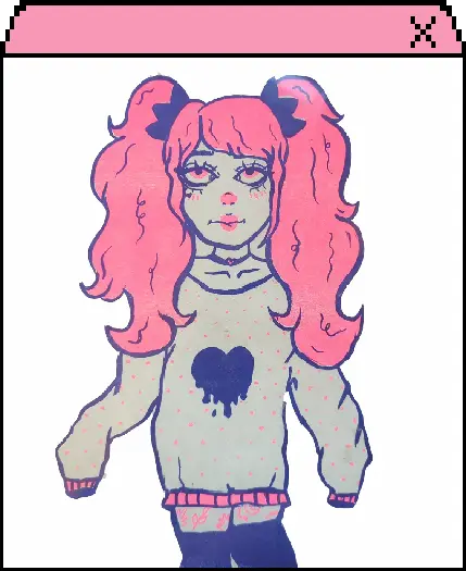
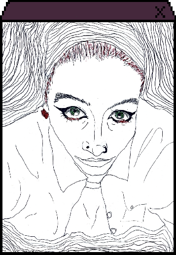
Nancy de Fries
Nice to meet you! I'm Najah and I'm always drawing. I have two pillows on my bed, one for me and the other for my sketchbook. Telling stories and making art is what I love to do. Want to follow me along?
Contact information:
Instagram: sr_scorpionrose
TikTok: sr_scorpionrose
The stories we tell either make our break the reality we hold before ourselves. But when I found a strange magazine in the attic of my house, I started to question what I truly knew about everything around me.
Everybody reads R.E.G.E.N. The people on earth read R.E.G.E.N. and the people a trillion light years away read R.E.G.E.N. A subscription to the magazine will keep you updated and entertained. Just make sure you don't get lost exploring the world beyond our atmosphere.
R.E.G.E.N. is a complete hand-drawn parody of entertainment culture with elements indulging in SCI-FI and horror themes.